Position adjustments
Kirill Müller, cynkra GmbH
June 1, 2017
Gears
Transmission type and number of gears are encoded in the same variable, a simple bar plot helps:
ggplot(data = mpg) +
  geom_bar(mapping = aes(x = trans))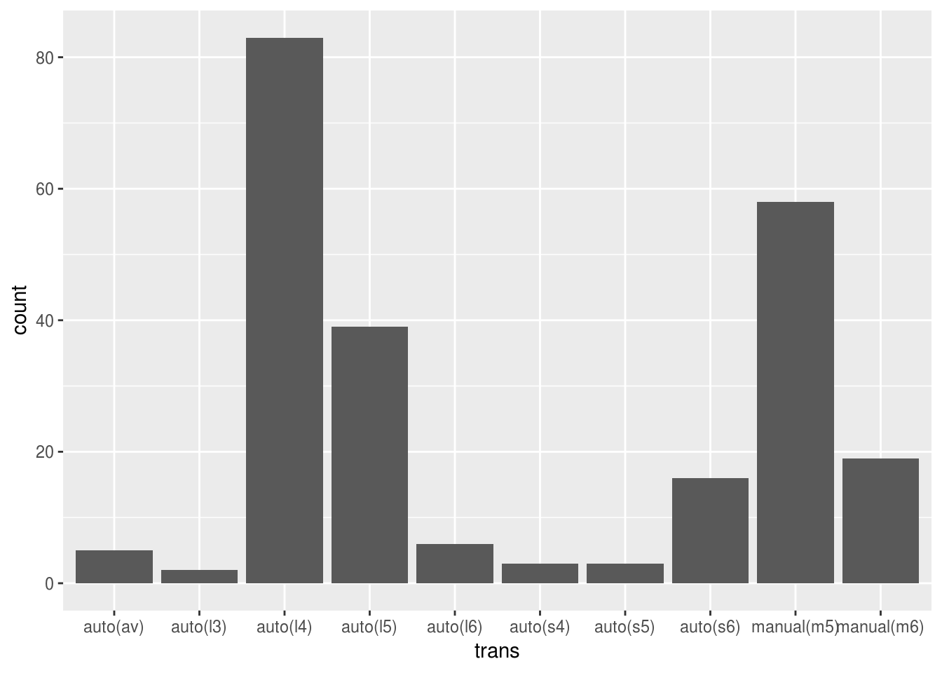
Visual inspection reveals that it’s four gears for automatic, and five gears for manual transmission.
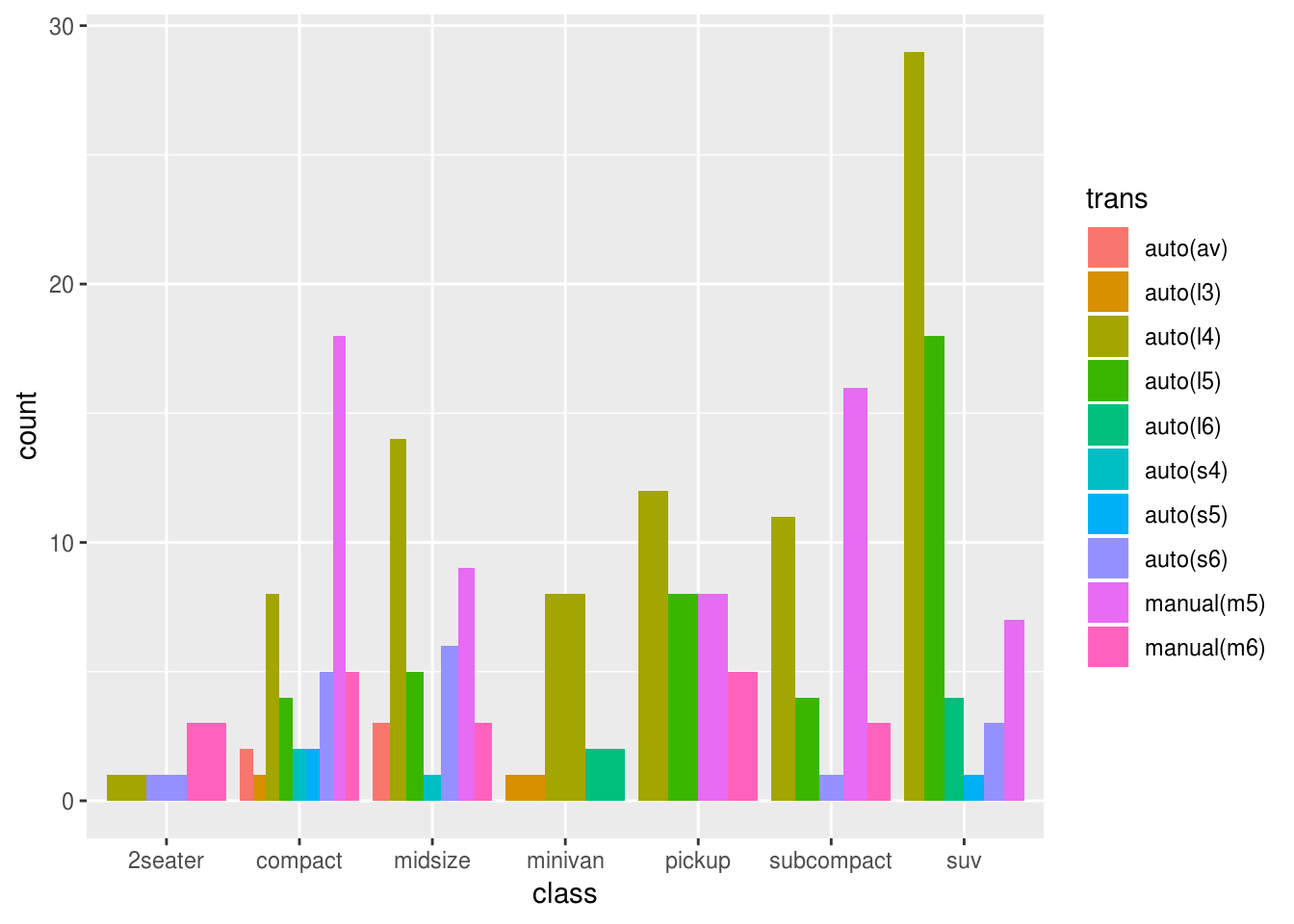
Discriminate by car class
ggplot(data = mpg) +
  geom_bar(mapping = aes(x = class, fill = trans))
SUVs have automatic mostly, 2-seaters favor six-gear manual, compact and subcompact mostly have five-gear manual transmission. This is much easier to see with position = "dodge", the different width of the bars indicates the number of different subgroups for each car class:
ggplot(data = mpg) +
  geom_bar(
    aes(x = class, fill = trans),
    position = "dodge"
  )
Boxplot
I’m using liters per 100 km as measure for fuel economy here.
ggplot(data = mpg) +
  geom_boxplot(mapping = aes(x = drv, y = 235 / hwy))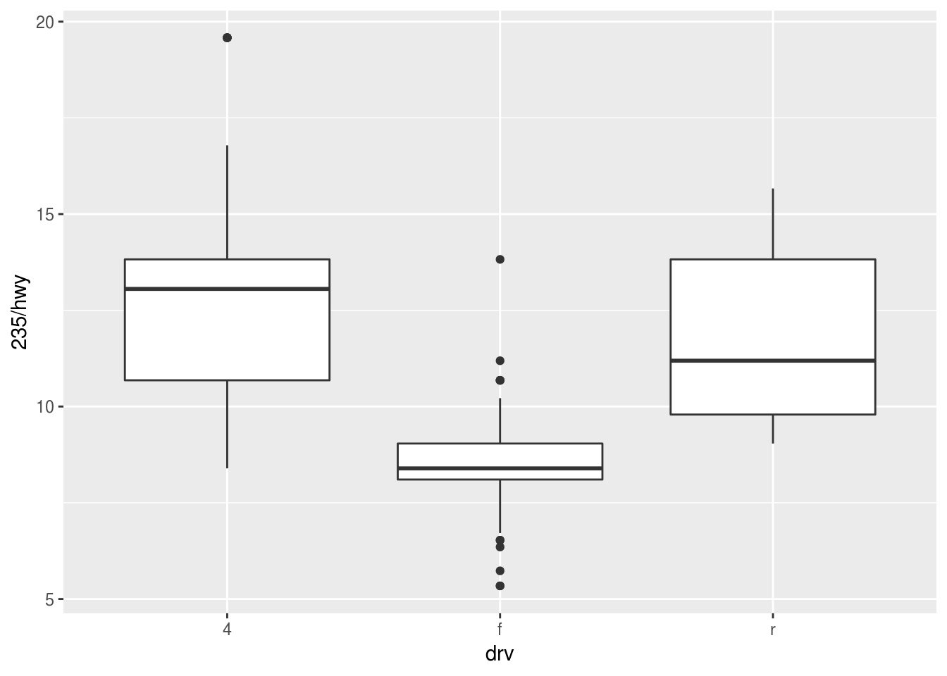
Forward drivetrains seem much more economical. Does the number of cylinders play a role? I’ll try the “fill” aesthetic:
ggplot(data = mpg) +
  geom_boxplot(mapping = aes(x = drv, y = 235 / hwy, fill = cyl))
No dice. Do I also need group = ?
ggplot(data = mpg) +
  geom_boxplot(
    mapping = aes(
      x = drv,
      y = 235 / hwy,
      fill = cyl,
      group = cyl
    )
  )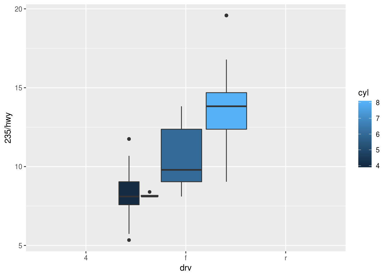
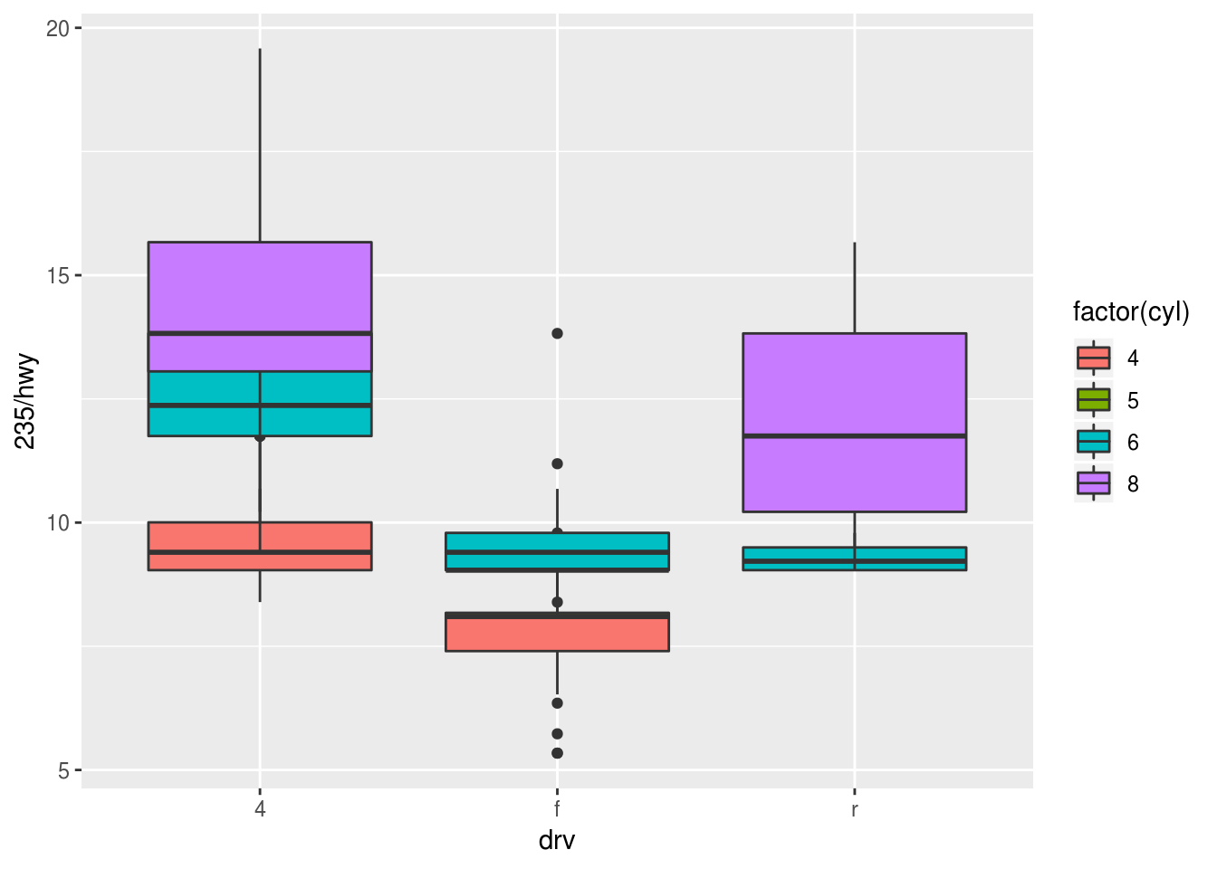
The legend reveals that cyl is a continuous variable. I’ll use its categorical equivalent, because the range is very limited.
ggplot(data = mpg) +
  geom_boxplot(
    mapping = aes(
      x = drv,
      y = 235 / hwy,
      fill = factor(cyl)
    )
  )
The default position setting looks good, let’s try "identity":
ggplot(data = mpg) +
  geom_boxplot(
    mapping = aes(
      x = drv,
      y = 235 / hwy,
      fill = factor(cyl)
    ),
    position = "identity"
  )
Doesn’t look useful.
Copyright © 2018 Kirill Müller. Licensed under CC BY-NC 4.0.