ggplot2 exercises part 2
Kirill Müller, cynkra GmbH
Reverse-engineering, theory
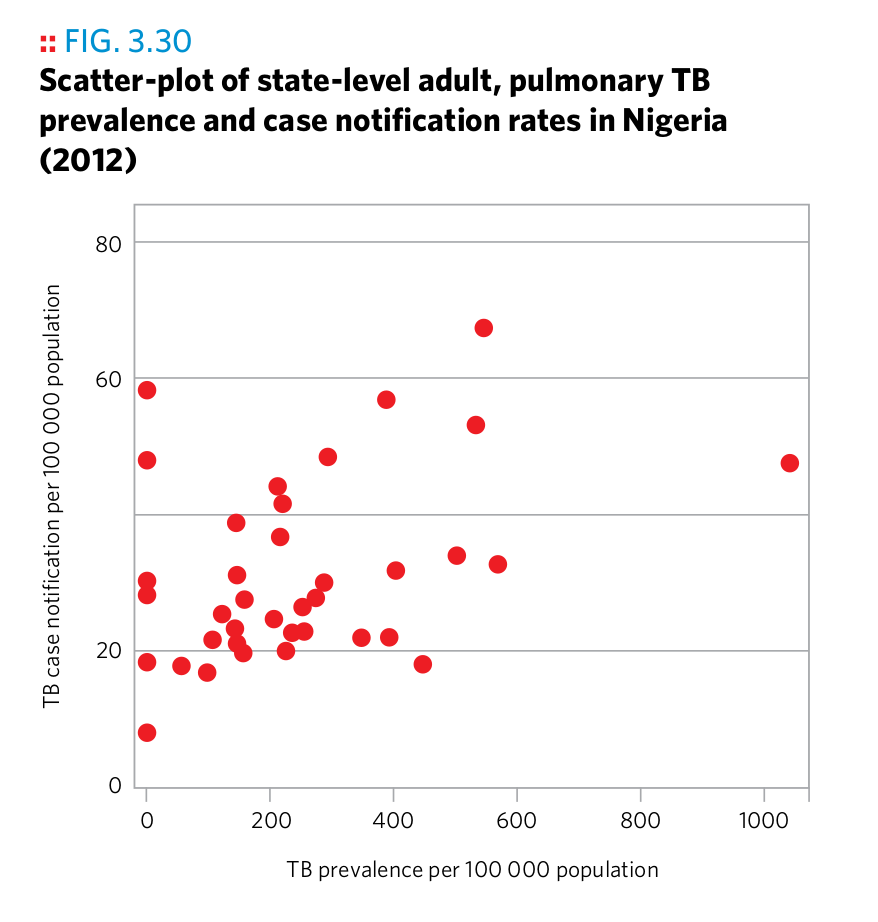
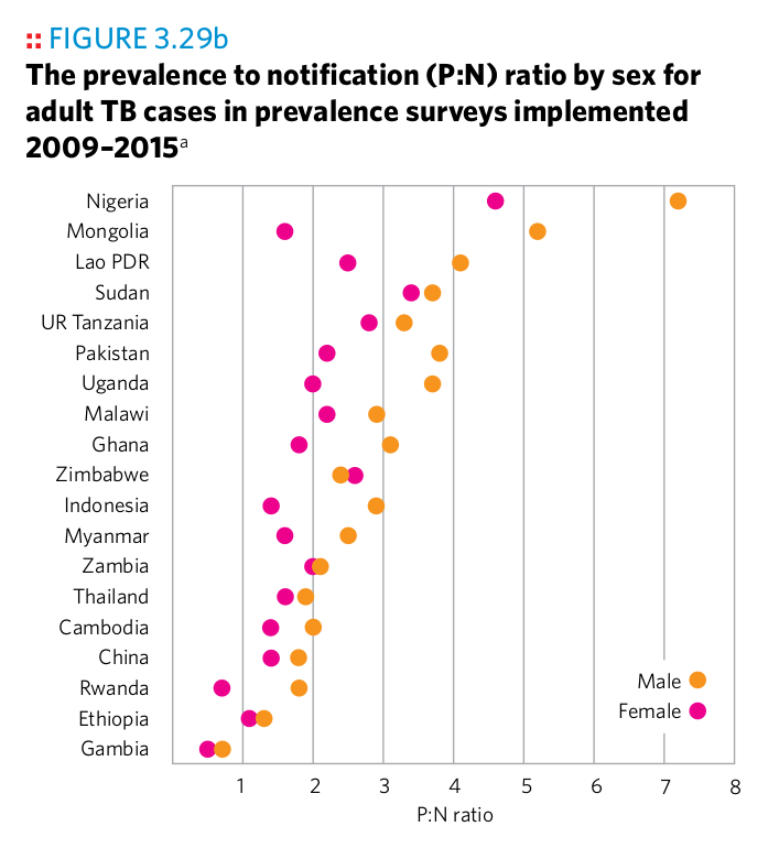
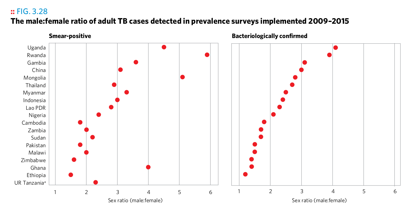
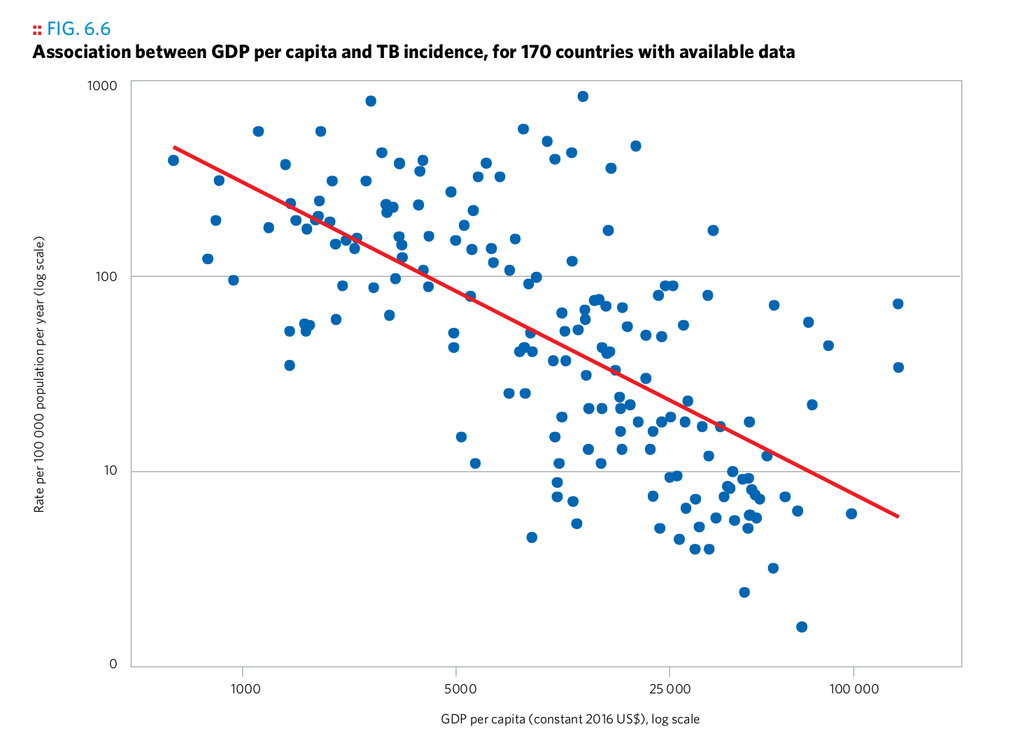
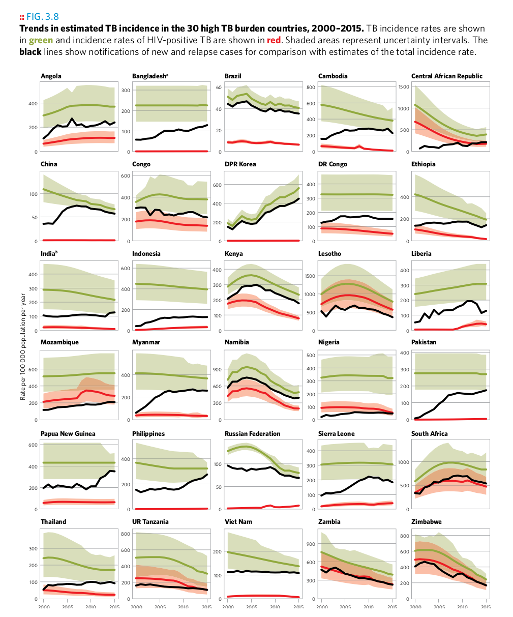
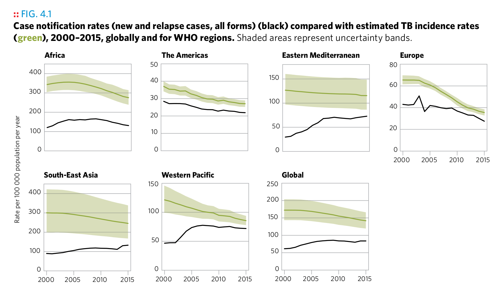
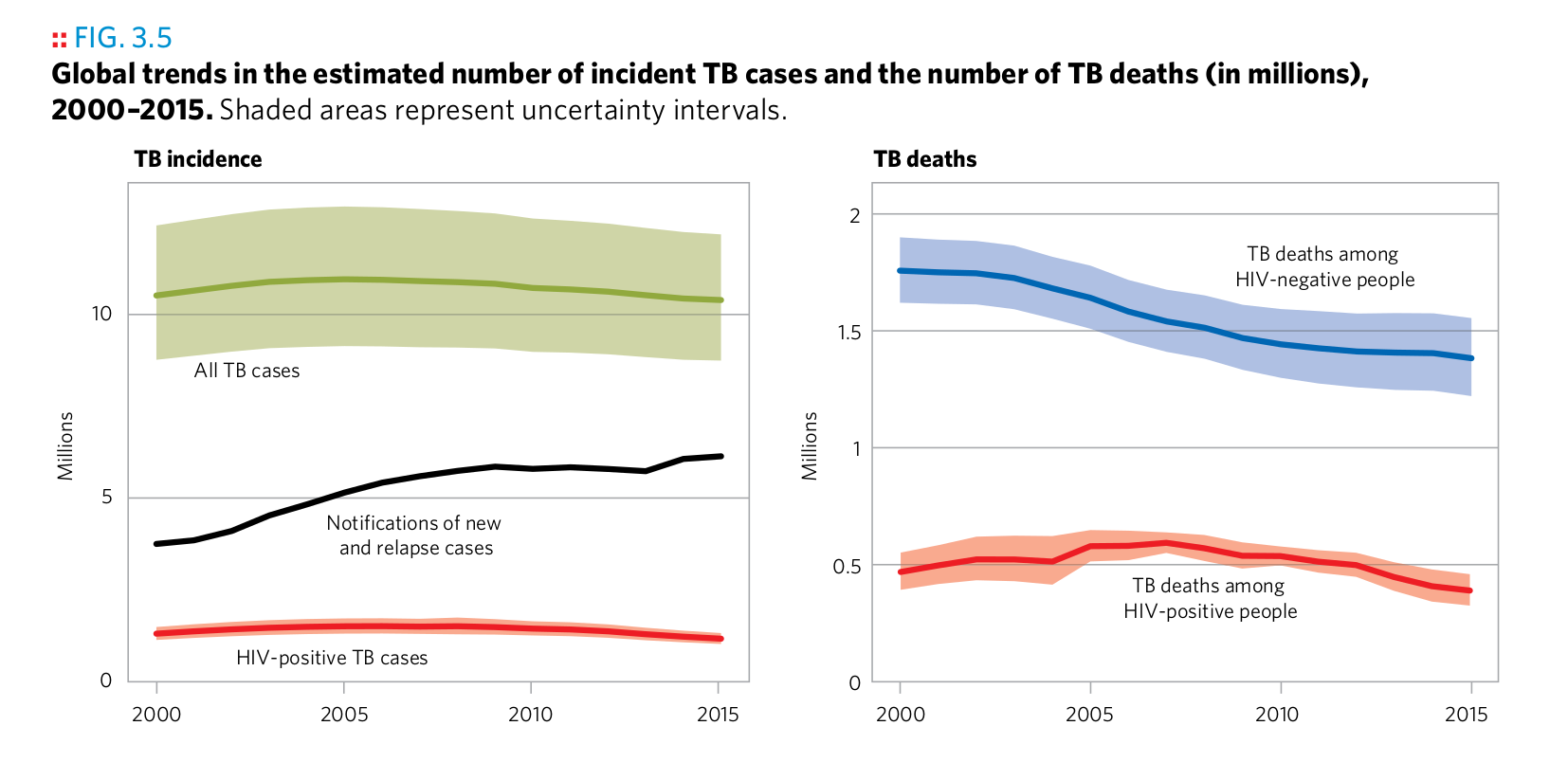
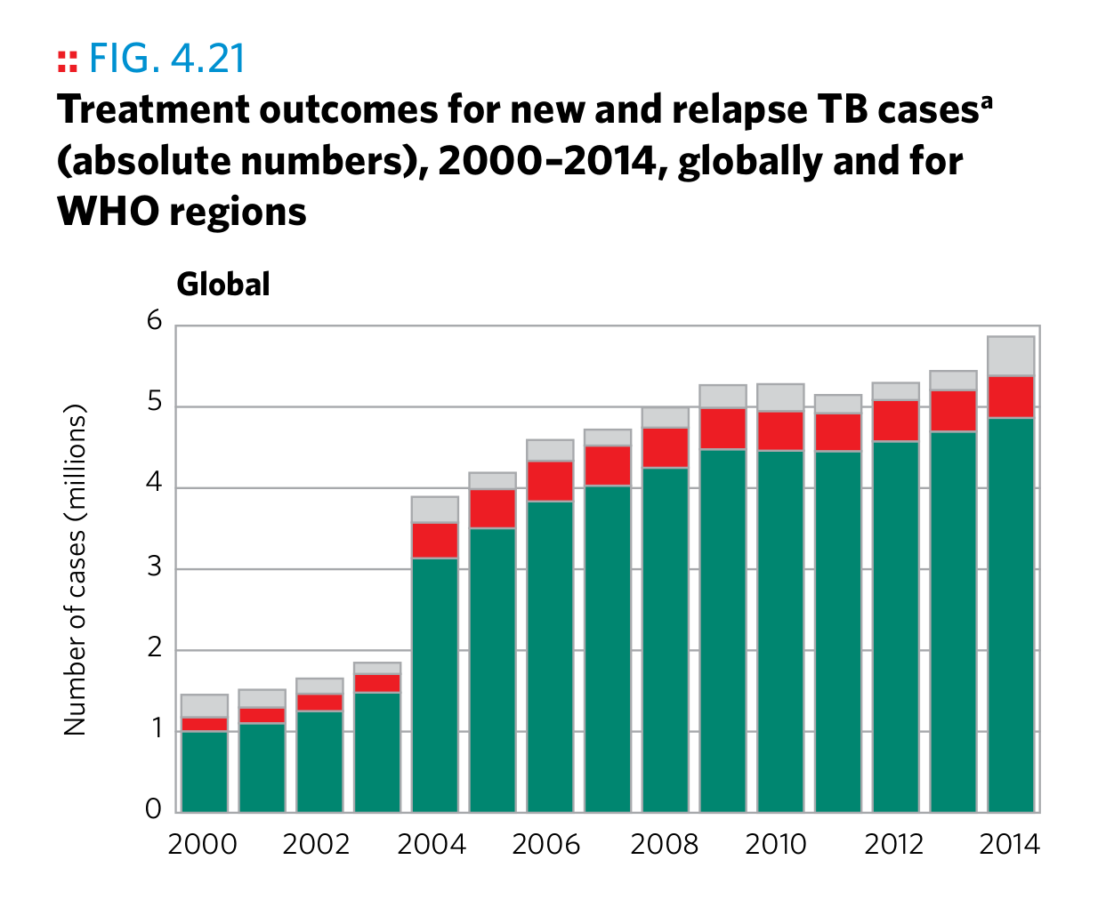
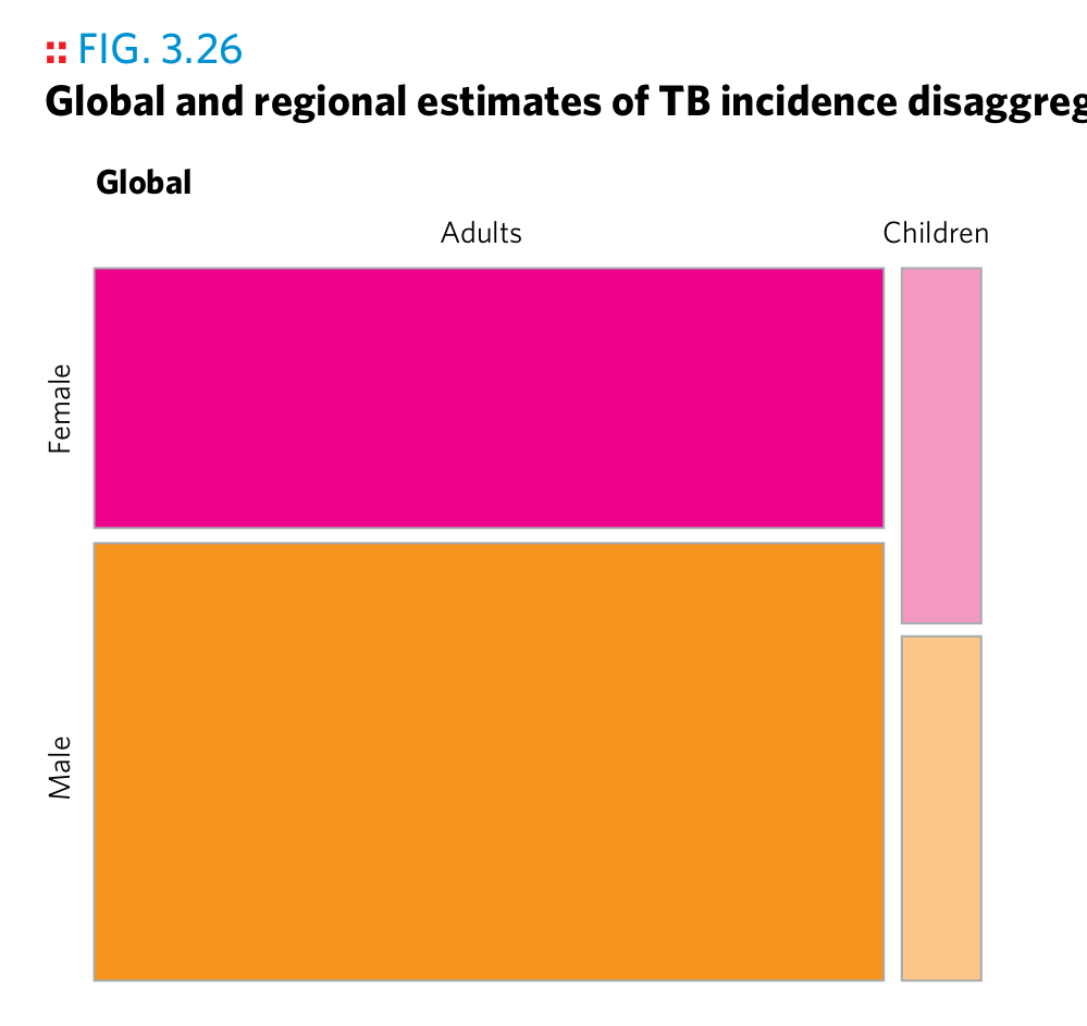
How could the authors of the 2016 WHO TB report have created the following plots? Assume that each plot is based on one or several suitably crafted dataset(s), i.e., that the data has been transformed in advance to support this particular plot. Answer the following questions for each plot:
- What layers (geoms) are used?
- Which variables are mapped to which aesthetics?
- Can you identify manual aesthetics (i.e., aesthetics that are unchanged for all observations?)
- What statistical transformations, if any, have been applied?
- What positional adjustments, if any, have been applied?
- If an image contains more than one graph, explain the mechanism.
- What does each observation in the plotting dataset represent?
- Do you notice details about the plot which you can’t explain yet?
Plot 1
Plot 1
Plot 2
Plot 2
Plot 3
Plot 3
Plot 4
Plot 4
Plot 5
Plot 5
Plot 6
Plot 6
Plot 7
Plot 7
Plot 8
Plot 8
Plot 9
Plot 9
Plot 10
Plot 10
Plot 11
Plot 11
Plot 12
Plot 12
Plot 13
Plot 13
Plot 14
Plot 14
Plot 15
Plot 15
Plot 16
Plot 16
Plot 17
Plot 17
Plot 18
Plot 18
Plot 19
Plot 19
Plot 20
Plot 20
Plot 21
Plot 21
Copyright © 2018 Kirill Müller. Licensed under CC BY-NC 4.0.