Facets
Kirill Müller, cynkra GmbH
June 1, 2017
Improvement over time?
We can split the simple scatterplot over two facets, one per year:
ggplot(data = mpg) +
  geom_point(mapping = aes(x = displ, y = hwy)) +
  facet_wrap(~year)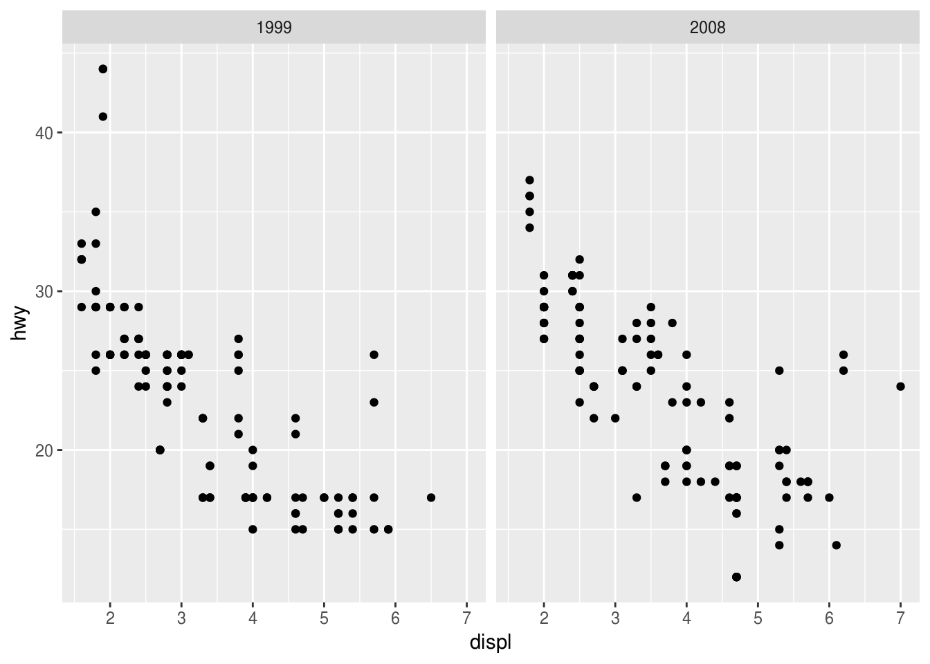
The smoothing layer seems to confirm a slight improvement, especially for engines with a displacement of three or more liters:
ggplot(data = mpg) +
  geom_point(mapping = aes(x = displ, y = hwy)) +
  geom_smooth(mapping = aes(x = displ, y = hwy)) +
  facet_wrap(~year)
## `geom_smooth()` using method = 'loess' and formula 'y ~ x'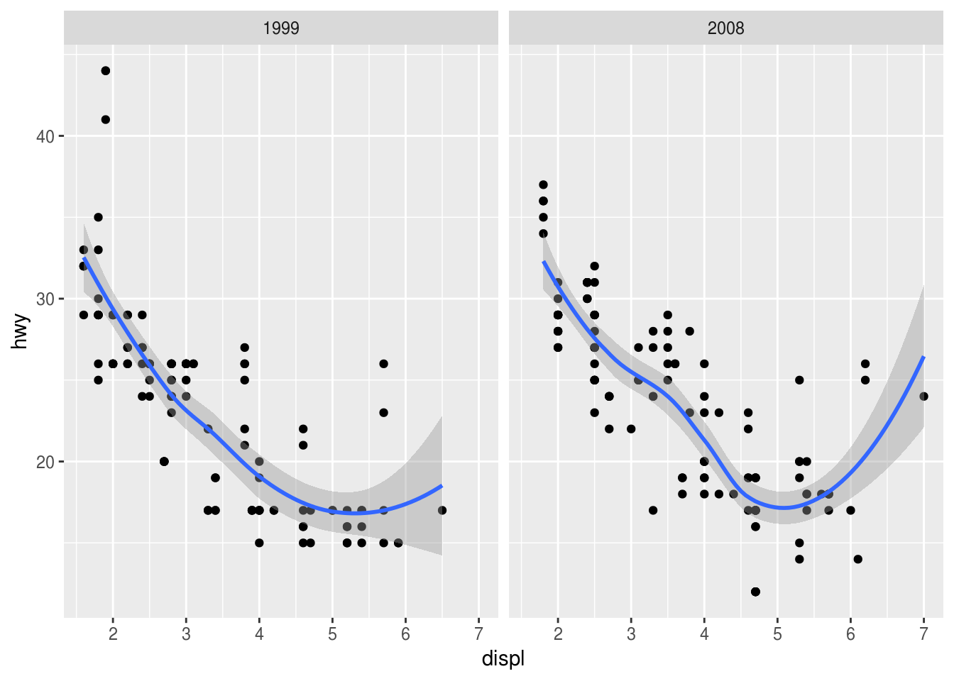
We can also look at each car class in parallel.
ggplot(data = mpg) +
  geom_point(mapping = aes(x = displ, y = hwy)) +
  facet_grid(year~class)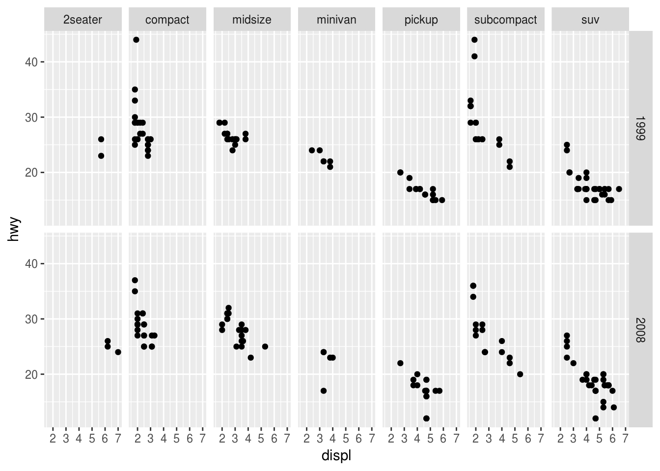
But too many facets may be not as helpful, we can also use color:
ggplot(data = mpg) +
  geom_point(
    mapping = aes(x = displ, y = hwy, color = factor(year))
  ) +
  geom_smooth(
    mapping = aes(x = displ, y = hwy, color = factor(year)),
    method = "lm"
  ) +
  facet_wrap(~class)
Labeling the facets
This is useful if the value does not speak for itself:
ggplot(data = mpg) +
  geom_point(mapping = aes(x = displ, y = hwy)) +
  facet_wrap(~cyl, labeller = "label_both")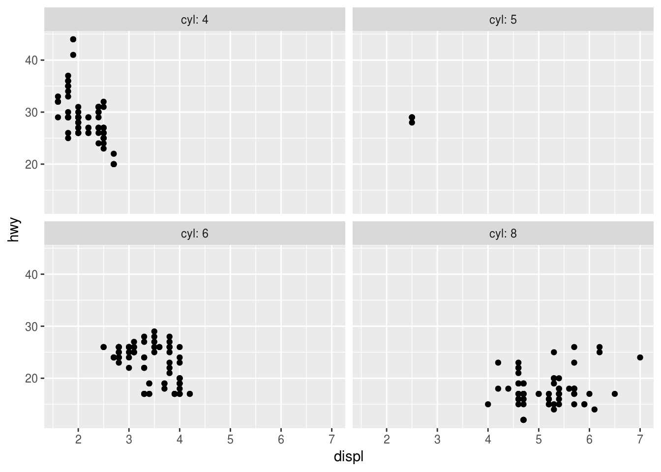
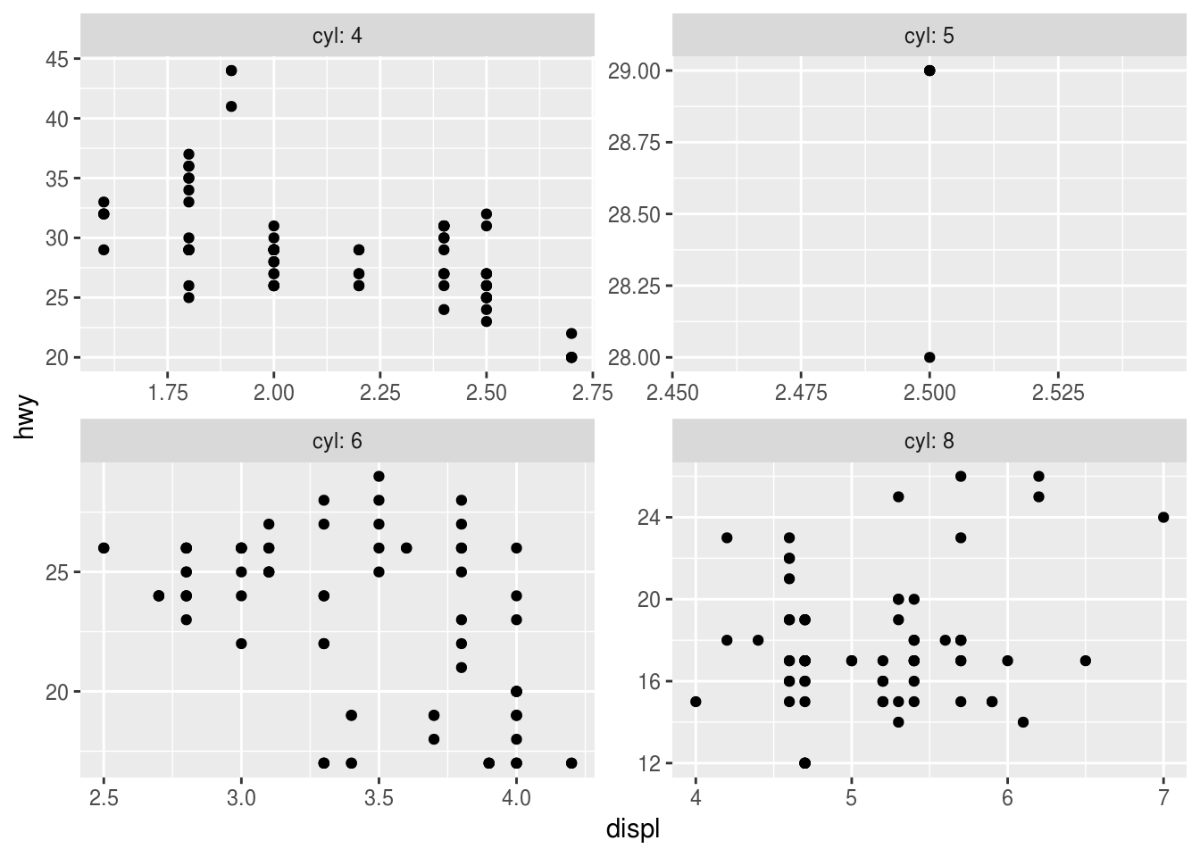
Different scales
Via the scales argument, zooms in to the range of the corresponding scale(s).
ggplot(data = mpg) +
  geom_point(mapping = aes(x = displ, y = hwy)) +
  facet_wrap(
    ~cyl,
    labeller = "label_both",
    scales = "free_x"
  )
ggplot(data = mpg) +
  geom_point(mapping = aes(x = displ, y = hwy)) +
  facet_wrap(
    ~cyl,
    labeller = "label_both",
    scales = "free_y"
  )
ggplot(data = mpg) +
  geom_point(mapping = aes(x = displ, y = hwy)) +
  facet_wrap(
    ~cyl,
    labeller = "label_both",
    scales = "free"
  )
Copyright © 2018 Kirill Müller. Licensed under CC BY-NC 4.0.