dplyr exercises part 2
Kirill Müller
October 18, 2017
Spreading and gathering
Use
spread()to converttable2totable1. What is the meaning of thekeyandvaluearguments?Use
gather()to converttable1totable2. Do you need an extra transformation to make the result fully identical? Can you reusekeyandvaluefrom the previous result?Use a bar chart to visualise the data. Which of
table1ortable2is more suitable for plotting?Use
gather()to converttable4aandtable4btotable2.Hint: Use
bind_rows()to combine similar tibbles.Create a scatterplot from the
mpgdataset that shows both highway and city fuel economy against engine displacement with two different colors using only onegeom_point()call.Find more exercises in Section 12.3.3 of r4ds.
Separating and uniting
Convert
table3totable1andtable2.Convert
table2totable3.Use
separate()to compute departure and arrival hours and minutes in theflightsdataset.Find more exercises in Section 12.4.3 of r4ds.
Keys and mutating joins
Do you see a problem in the
presidentialdataset? Can you see how does this affect the following bar plot without actually running the code?presidential %>% mutate(term = end - start) %>% ggplot() + geom_bar(aes(name, term))How are the
flights,carriers, andairportsdatasets connected? Which are primary, which are foreign keys?Hint: Use
count()to support your hypothesis.Plot a heat map of destination by airline for all flights shorter than 300 miles. Use explicit names for the carriers and the destinations. Does the result change if you use a full join? Do you use
geom_raster()orgeom_bin2d()?Hint: Use
by = c("dest" = "faa").Find more exercises in Section 13.4.6 of r4ds.
Filtering joins
Find the airports that are serviced by at least one flight. Which airports did not have direct connections in 2013?
Find more exercises in Section 13.5.1 of r4ds.
Time trends
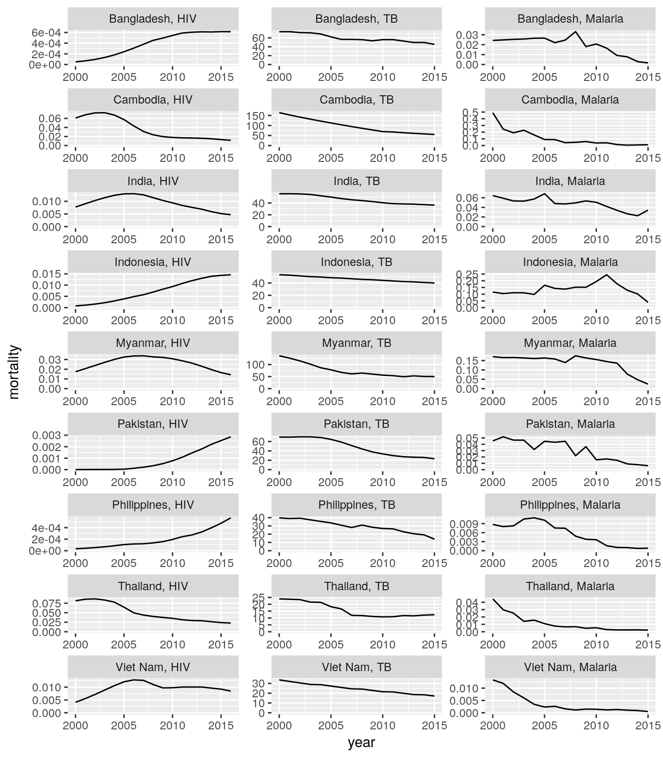
Create plots for time trends of new HIV, new TB, and new malaria cases for all countries of a high-impact region of your choice. Each panel should show the data for one country.
Hint: Use the
gfdatapackage.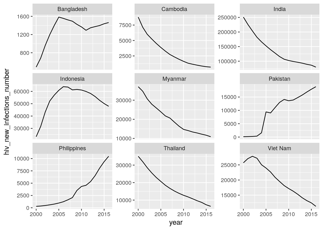
## Warning: Removed 1 rows containing missing values (geom_path).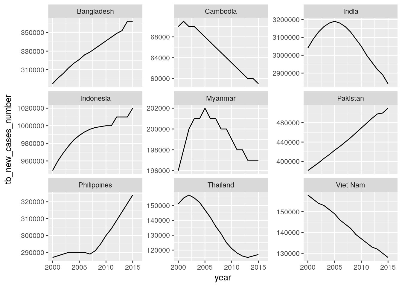
## Warning: Removed 1 rows containing missing values (geom_path).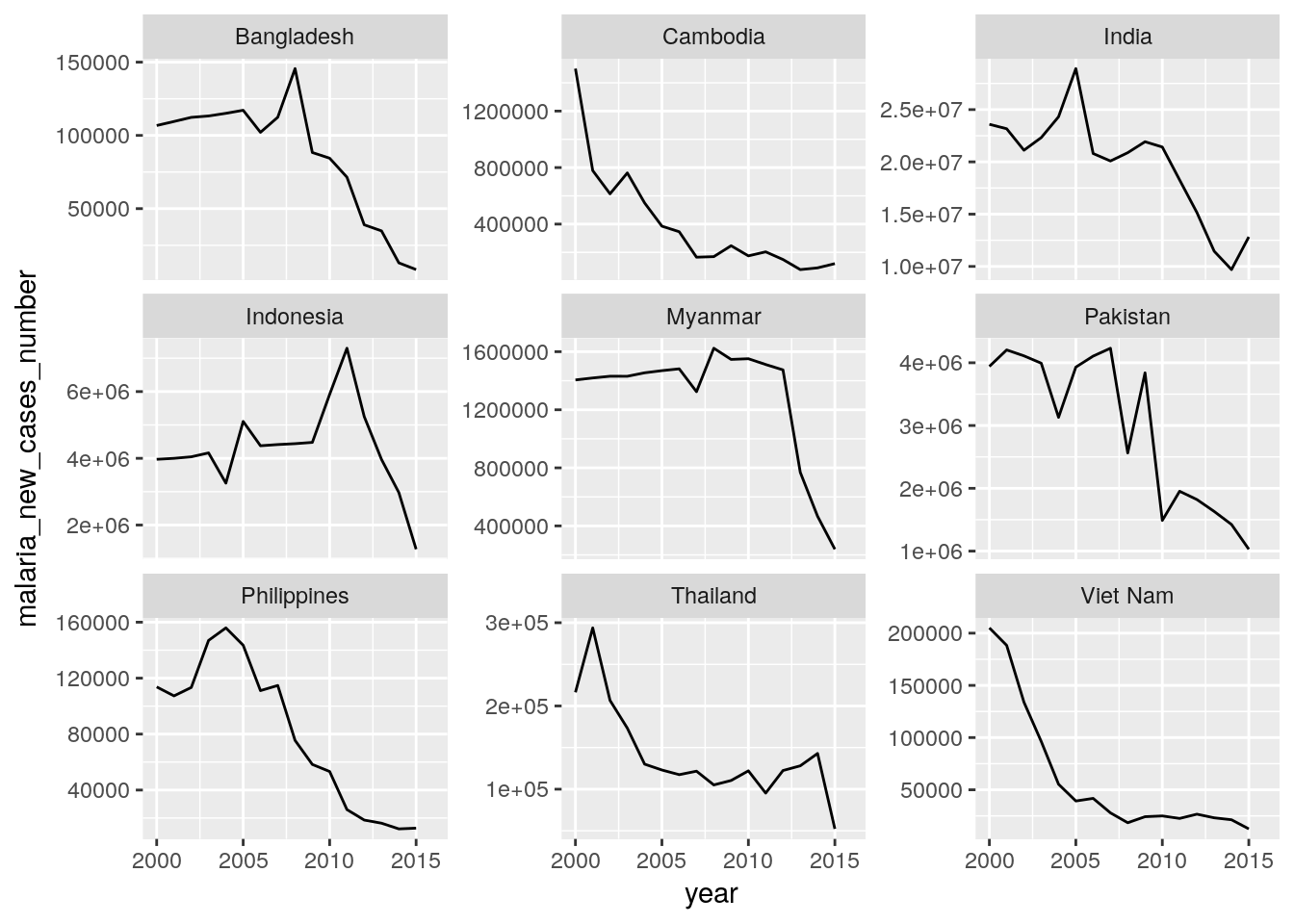
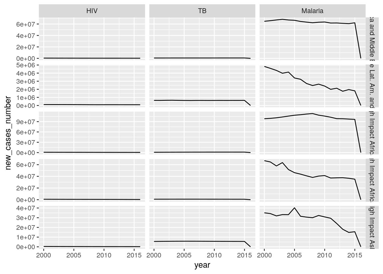
Create a single plot that shows time trends of new HIV, new TB, and new malaria cases for all countries of a high-impact region of your choice. Each panel should show the data for one country and one disease.
Hint: You need to reorganize your data. Use
rename()to bring the columns into a consistent format, and a combination ofspread(),gather(), andseparate(..., into = c("disease", "indicator"), extra = "merge")to extract the disease from the rest of the column name.## Warning: Removed 1 rows containing missing values (geom_path).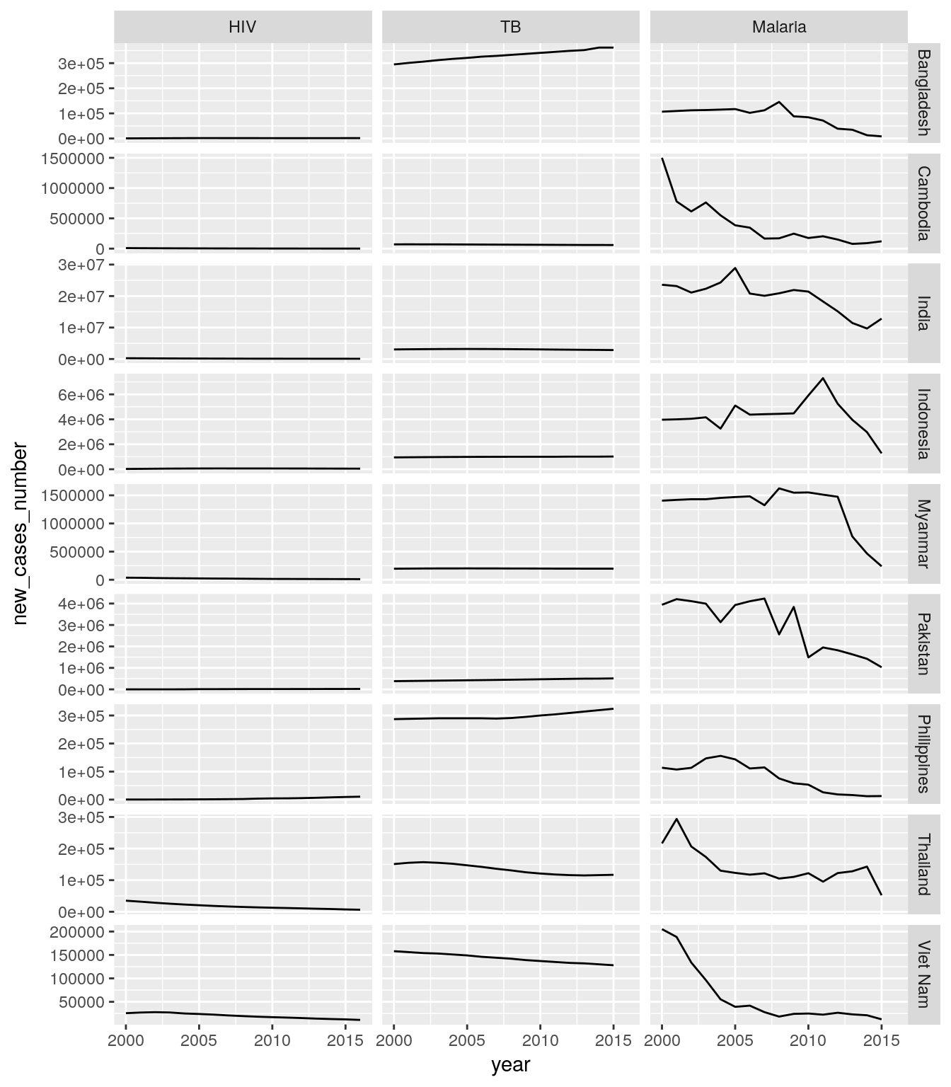
Create a single plot that shows aggregated time trends of new HIV, new TB, and new malaria cases for all regions, composed of the sum of all cases from each country in a reagion. Each panel should show the data for one region and one disease. At which stage in the data processing do you implement the aggregation?
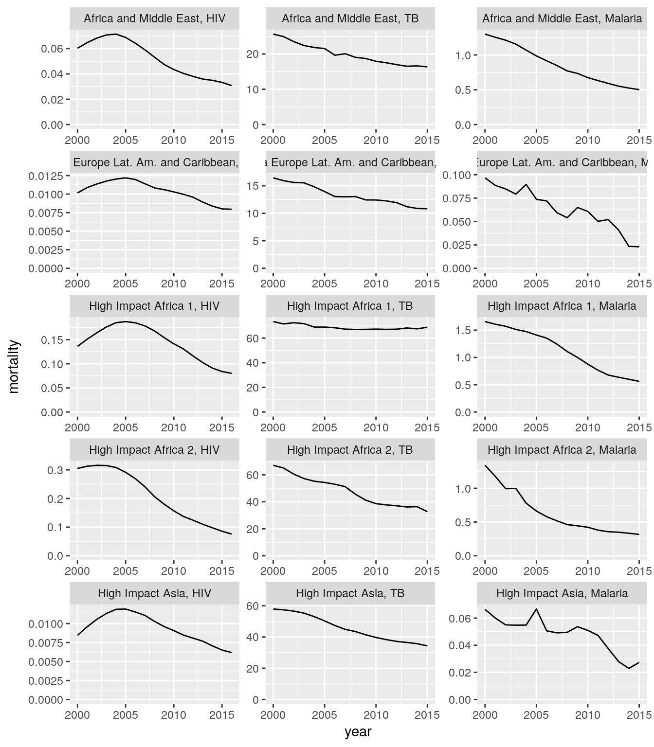
Create a single plot that shows time trends of mortality or incidence rates for HIV, TB, and malaria cases for all countries of a high-impact region of your choice. Each panel should show the data for one region and one disease.
Hint: you need to create the following new variables first. Use a consistent naming scheme.- HIV incidence rate = number of new HIV infections
hiv_new_infections_numberdivided by uninfected population in the previous year (t-1)population_excluding_plwhamultiplied by 100 - HIV mortality rate = number of AIDS deaths
aids_deaths_numberdivided by total populationpopulation_all_agesmultiplied by 100 - TB incidence rate = number of new TB cases
tb_new_cases_numberdivided by total populationpopulation_all_agesmultiplied by 100,000 - TB mortality rate = number of TB deaths
tb_deaths_numberdivided by total populationpopulation_all_agesmultiplied by 100,000 - Malaria incidence rate = number of new malaria cases
malaria_new_cases_numberdivided by population at malaria riskpopulation_at_malaria_riskmultiplied by 1000 - Malaria mortality rate = number of malaria deaths
malaria_deaths_numberdivided by population at malaria riskpopulation_at_malaria_riskmultiplied by 1000
- HIV incidence rate = number of new HIV infections
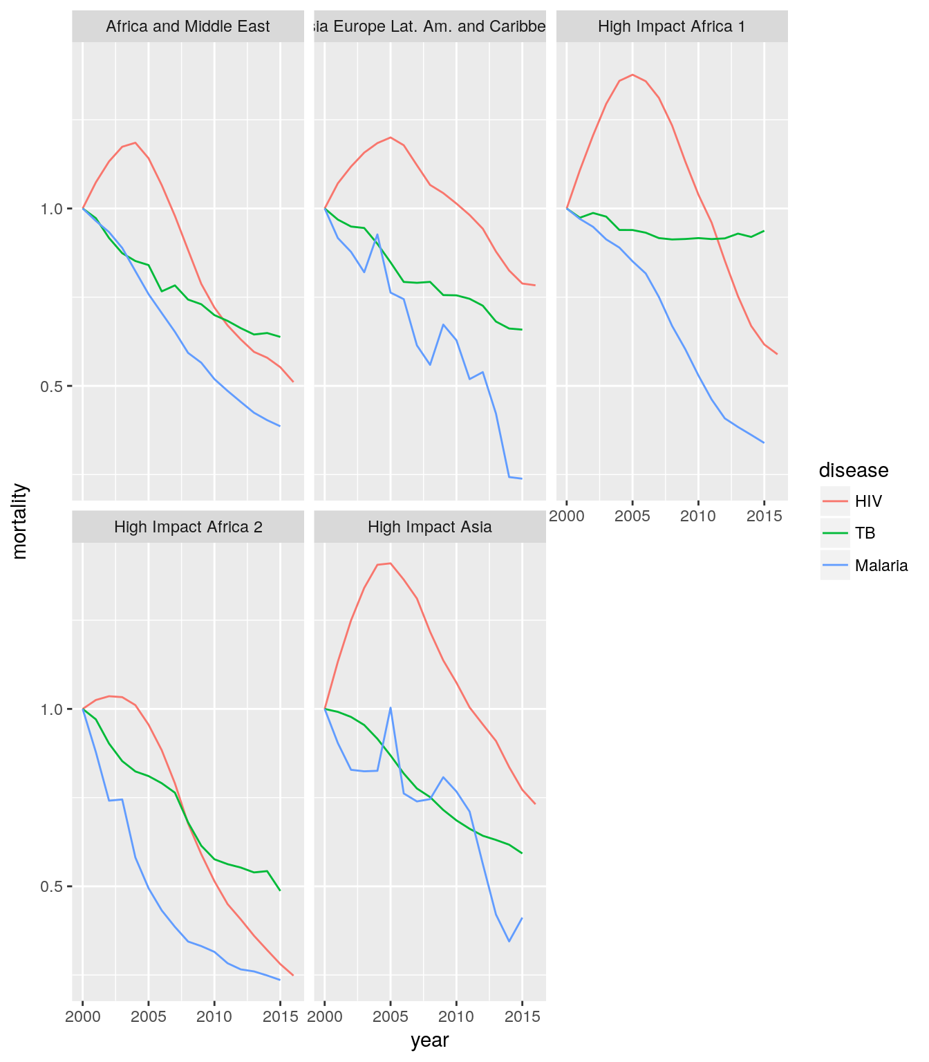
Create a single plot that shows aggregated time trends of mortality or incidence rates for HIV, TB, and malaria cases for all regions. Each panel should show the data for one region and one disease.
Hint: You need to sum the numerators across relevant countries and divide it by sum of the denominators across the same set of countries.
Assignment 5
Create a single plot that shows time trends of mortality or incidence rates for HIV, TB, and malaria cases for all countries in all high-impact regions, compared against the year 2000 baseline. Each panel should show the data for one region.
Hint: Use
first()with a groupedmutate().
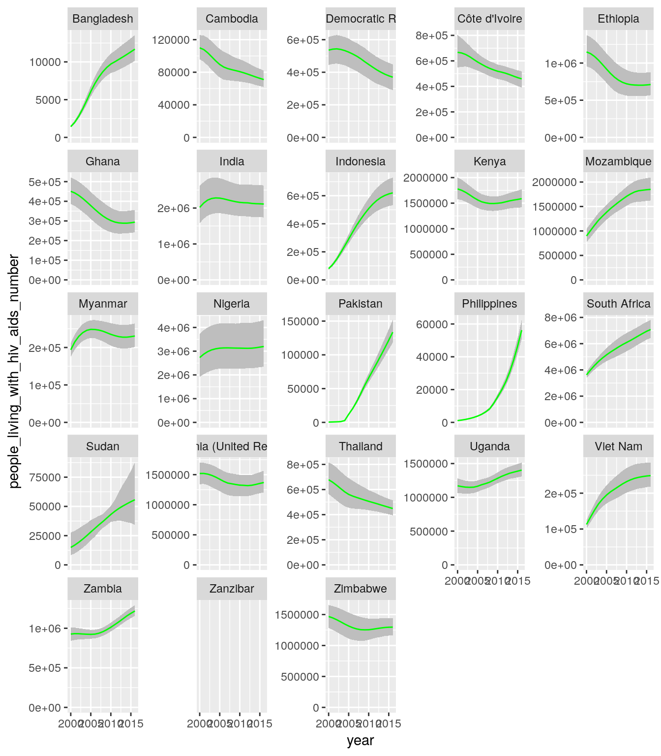
- Create a single plot that shows time trends of the number of people living with HIV/AIDS in need for ART (
people_living_with_hiv_aids_numberand the correspondinglowerandhigheruncertainty ranges) for all countries in all high-impact regions. Each panel should show the data for one country.
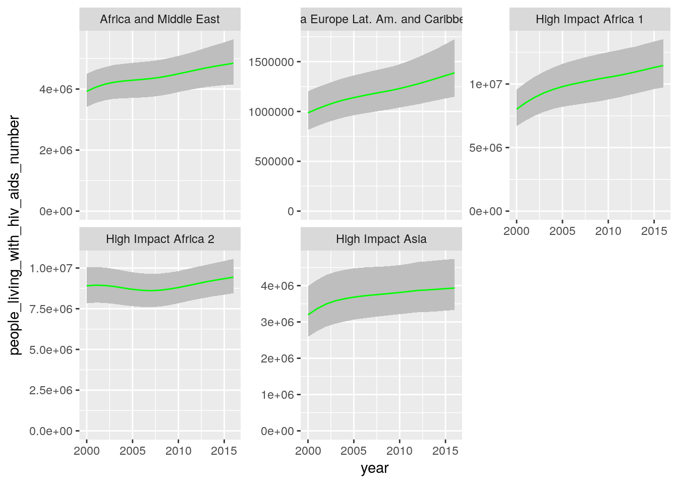
- Create a single plot that shows time trends of the number of people living with HIV/AIDS in need for ART aggregated over all countries in a region. Each panel should show the data for one region.
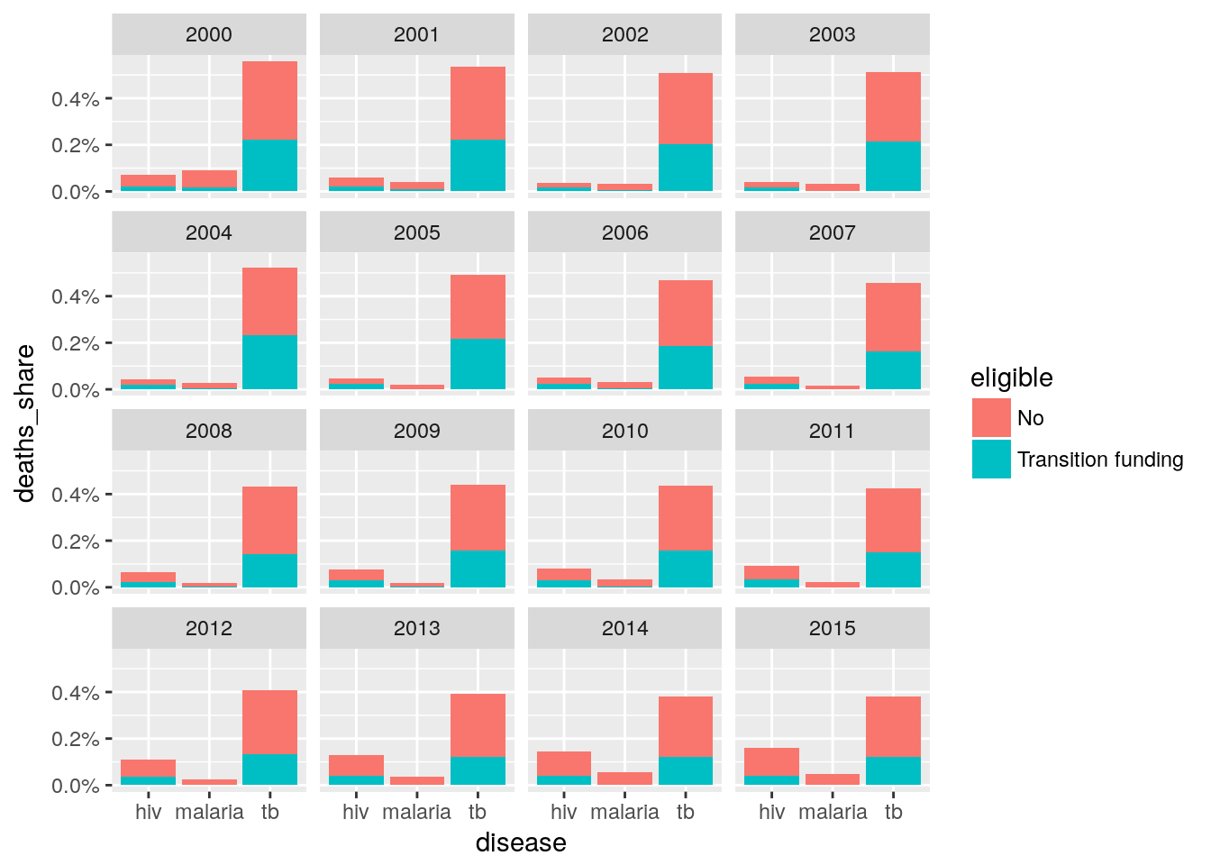
- Create a stack bar graph with three bars, each bar represents one disease and the indicator should be number of deaths for each disease in 2015. The stacks should be expressed as percent and three categories of eligibility. This shows across Global Fund supported countries for three diseases what share of deaths is not covered in each disease due to not being eligible.
Load data from sheets 1 to 9 in the Excel file and bring them into a tidy format.
Hint: The path to the Excel file on the RStudio server is
"/data/r-course/courswork_data_tgf.xlsx". Before reading the file, create a link to the"/data/r-course"directory usingfile.symlink(). Usereadxl::read_excel()and look at the documentation of thesheetandrangearguments to that function. How do you specify column names?
Case study
Use your own data to answer a question about it using the tools you have learned in this course.
Hint: To import, use the “readr” (CSV), “readxl” (Excel), or “haven” (SPSS/SAS/Stata) packages. Use the internet to find out how to import other kinds of data, use
as_tibble()right after importing to get consistent printing.Alternatively, create a plot of the total number of tuberculosis cases per year for eight countries of your choice. Can you also plot the share (relative to the overall population of the country)?
Copyright © 2017 Kirill Müller. Licensed under CC BY-NC 4.0.