Geoms
Kirill Müller, Patrick Schratz
Arguments to geom_smooth()
Try geom_smooth(). What do the arguments se and method to geom_smooth() change?
ggplot(data = mpg) +
  geom_smooth(
    mapping = aes(x = displ, y = hwy),
    se = ___,
    method = ___
  )
► Solution:
method uses a different model to fit the data:
ggplot(data = mpg) +
  geom_point(mapping = aes(x = displ, y = hwy)) +
  geom_smooth(mapping = aes(x = displ, y = hwy), method = "lm")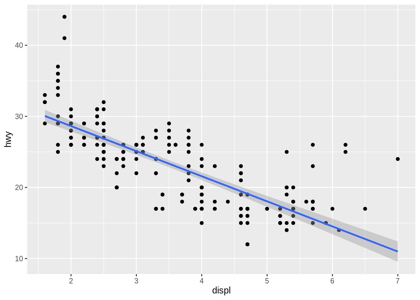
se = FALSE turns off the confidence band:
ggplot(data = mpg) +
  geom_point(mapping = aes(x = displ, y = hwy)) +
  geom_smooth(mapping = aes(x = displ, y = hwy), se = FALSE)
## `geom_smooth()` using method = 'loess' and formula 'y ~ x'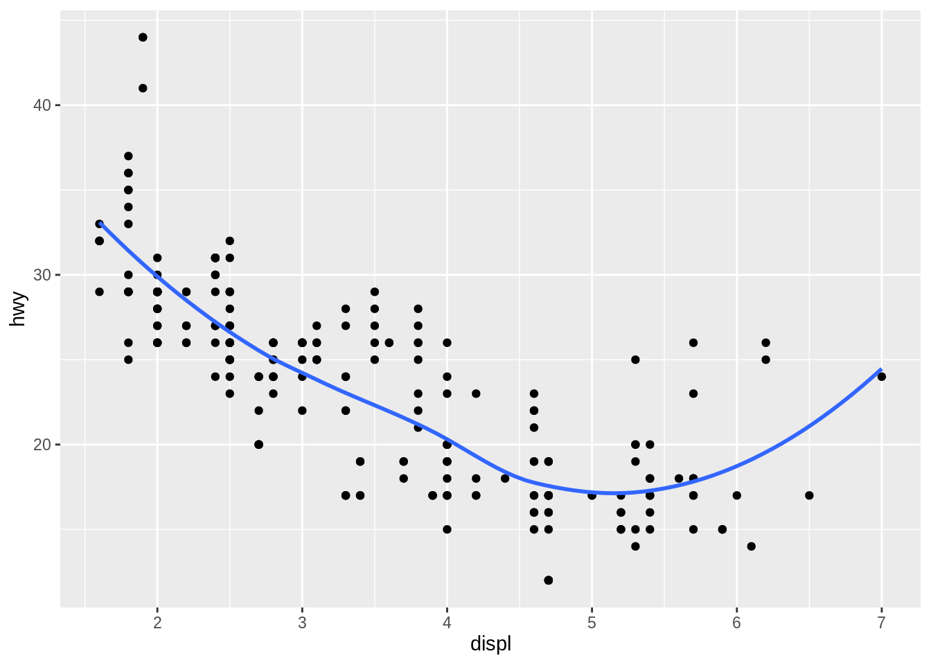
The rug
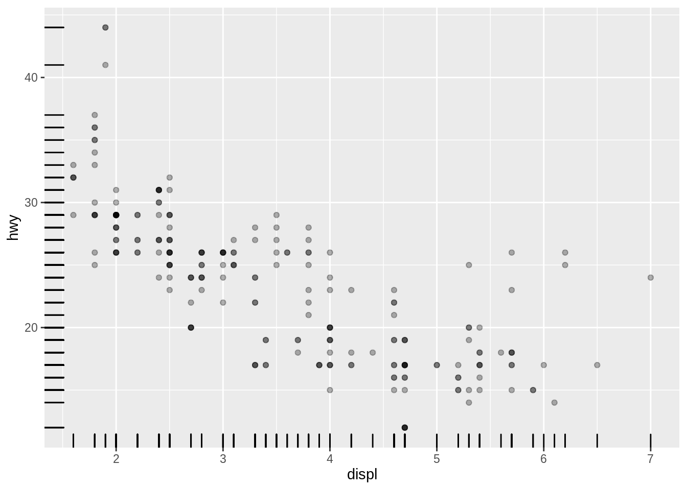
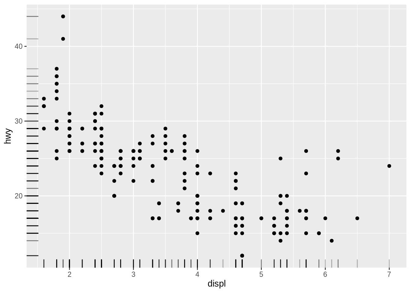
What does geom_rug() do? Try to reduce overplotting with transparency or by adding position = "jitter". How do you reduce overplotting for the points layer?
ggplot(data = mpg) +
  geom_point(
    mapping = aes(x = displ, y = hwy),
    ___ = ___
  ) +
  geom_rug(
    mapping = aes(x = displ, y = hwy),
    ___ = ___
  )
► Solution:
Plots marginal distributions of the data close to the axes.
ggplot(data = mpg) +
  geom_point(mapping = aes(x = displ, y = hwy)) +
  geom_rug(mapping = aes(x = displ, y = hwy))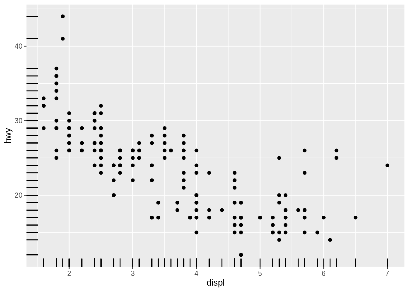
To reduce overplotting, the “alpha” aesthetic can be set independently for each geom to a constant value:
ggplot(data = mpg) +
  geom_point(
    mapping = aes(x = displ, y = hwy),
    alpha = 0.3
  ) +
  geom_rug(
    mapping = aes(x = displ, y = hwy)
  )
ggplot(data = mpg) +
  geom_point(
    mapping = aes(x = displ, y = hwy)
  ) +
  geom_rug(
    mapping = aes(x = displ, y = hwy),
    alpha = 0.3
  )
Order of geom_...() calls
How does the order of the geom_...() calls affect the display?
ggplot(data = ___, mapping = aes(_____)) +
  geom_point() +
  geom_smooth()
ggplot(data = ___, mapping = aes(_____)) +
geom_smooth() +
geom_point()► Solution:
The geoms are painted in order of appearance:
ggplot(data = mpg) +
  geom_point(mapping = aes(x = displ, y = hwy)) +
  geom_smooth(mapping = aes(x = displ, y = hwy))
## `geom_smooth()` using method = 'loess' and formula 'y ~ x'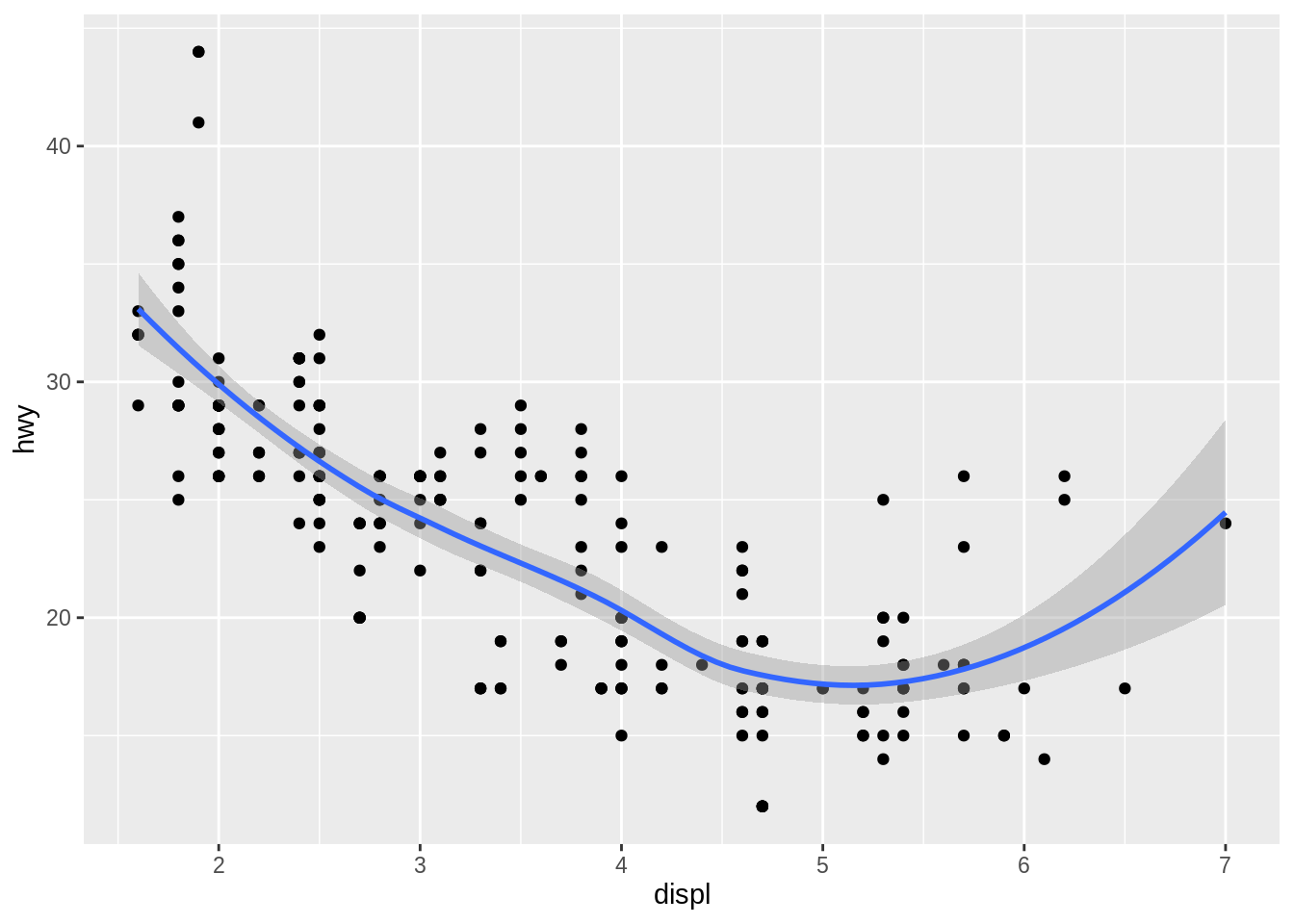
ggplot(data = mpg) +
  geom_smooth(mapping = aes(x = displ, y = hwy)) +
  geom_point(mapping = aes(x = displ, y = hwy))
## `geom_smooth()` using method = 'loess' and formula 'y ~ x'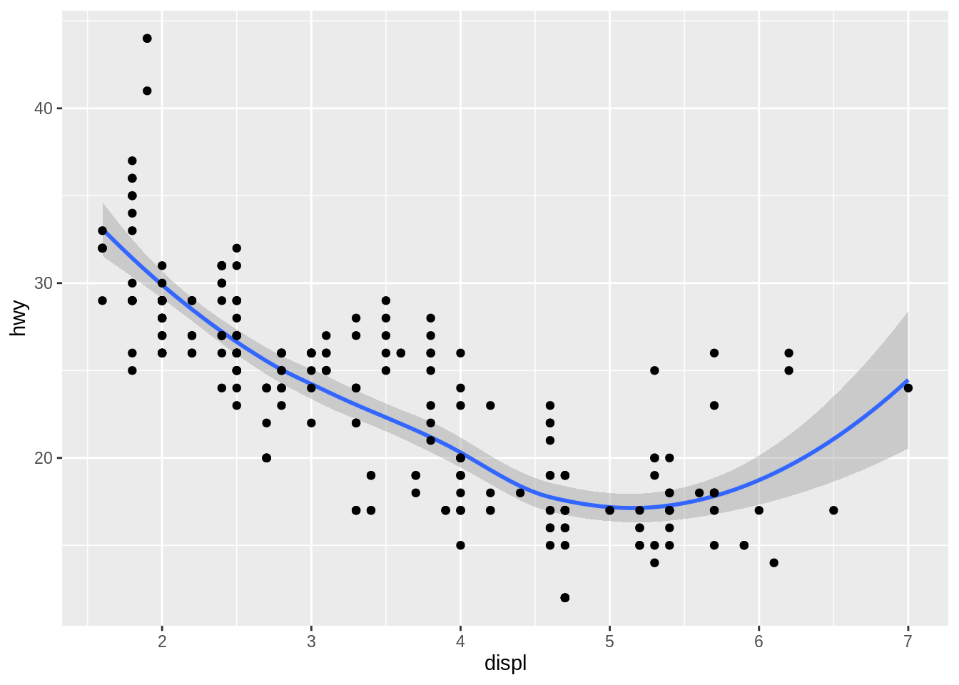
Compare highway and city
Can you plot both highway and city economy in one plot?
Hint: The solution to this exercise is not the recommended way of doing this in ggplot2. We’ll find a better way in a subsequent exercise.
ggplot(_____) +
  geom_point(mapping = _____, color = "___") +
  geom_point(mapping = _____, color = "___")
► Solution:
We could add two layers, each with a different color. But this still doesn’t give us a legend.
ggplot(data = mpg) +
  geom_point(mapping = aes(x = displ, y = hwy), color = "red") +
  geom_point(mapping = aes(x = displ, y = cty), color = "blue")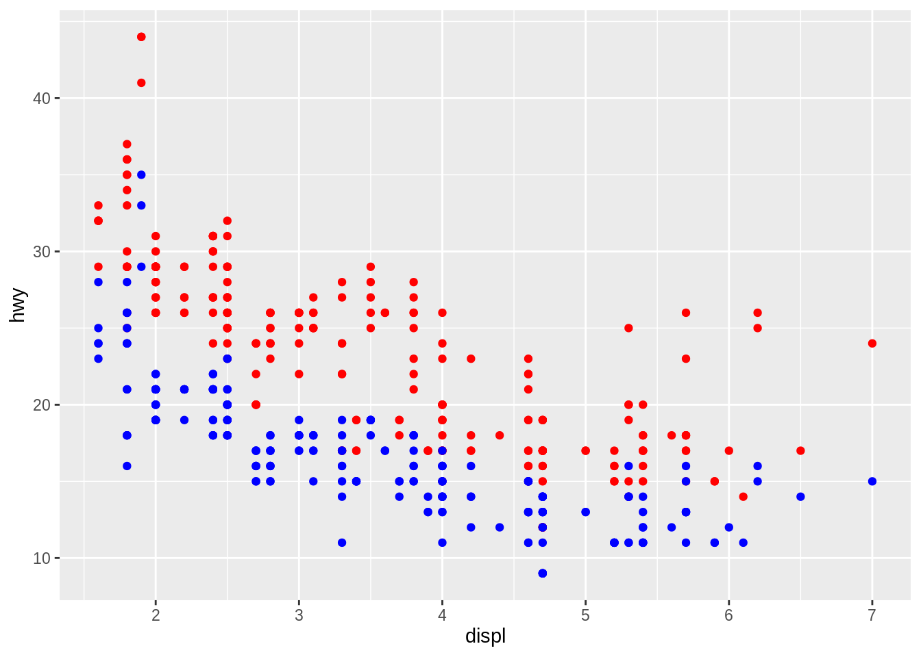
Cars by drivetrain
Use a bar plot to find out how many cars of each drivetrain (front/rear/4wd) the mpg dataset contains. Which aesthetic mappings do you need to specify?
Hint: Find the relevant geom by typing geom_ on the console or in your script file.
ggplot(_____, aes(_____)) +
  geom____()
► Solution:
I tried geom_histogram() and geom_col(), neither worked. The histogram is for continuous data only, for geom_col() I’d need to supply actual counts which I don’t have. The geom_bar() function computes the counts for me by applying the "count" statistical transformation to my data before plotting.
We need only the “x” aesthetic, “y” is computed automatically. drv is the relevant variable.
ggplot(mpg) +
  geom_bar(aes(x = drv))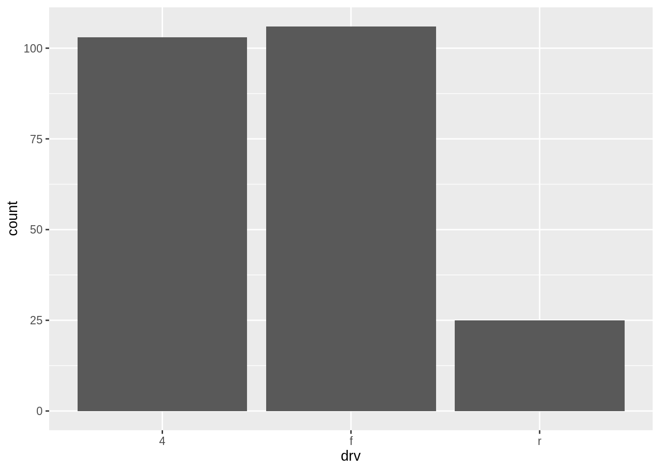
More exercises
Find more exercises in Sections 3.6.1 and 3.7.1 of r4ds.
Copyright © 2019 Kirill Müller. Licensed under CC BY-NC 4.0.