Coordinate systems
Kirill Müller, cynkra GmbH
Flipped boxplot
Create a flipped boxplot of fuel economy by transmission type.
► Solution:
ggplot(data = mpg) +
  geom_boxplot(mapping = aes(x = trans, y = hwy)) +
  coord_flip()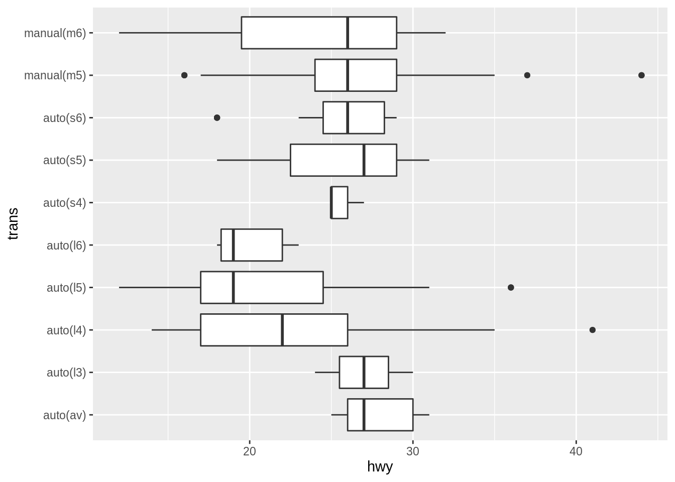
Compare highway and city
Plot highway vs. city fuel economy with an additional geom_abline() layer. How do you set a 45° degree for the diagonal line?
► Solution:
ggplot(data = mpg) +
  geom_jitter(mapping = aes(x = cty, y = hwy)) +
  geom_abline(color = "red")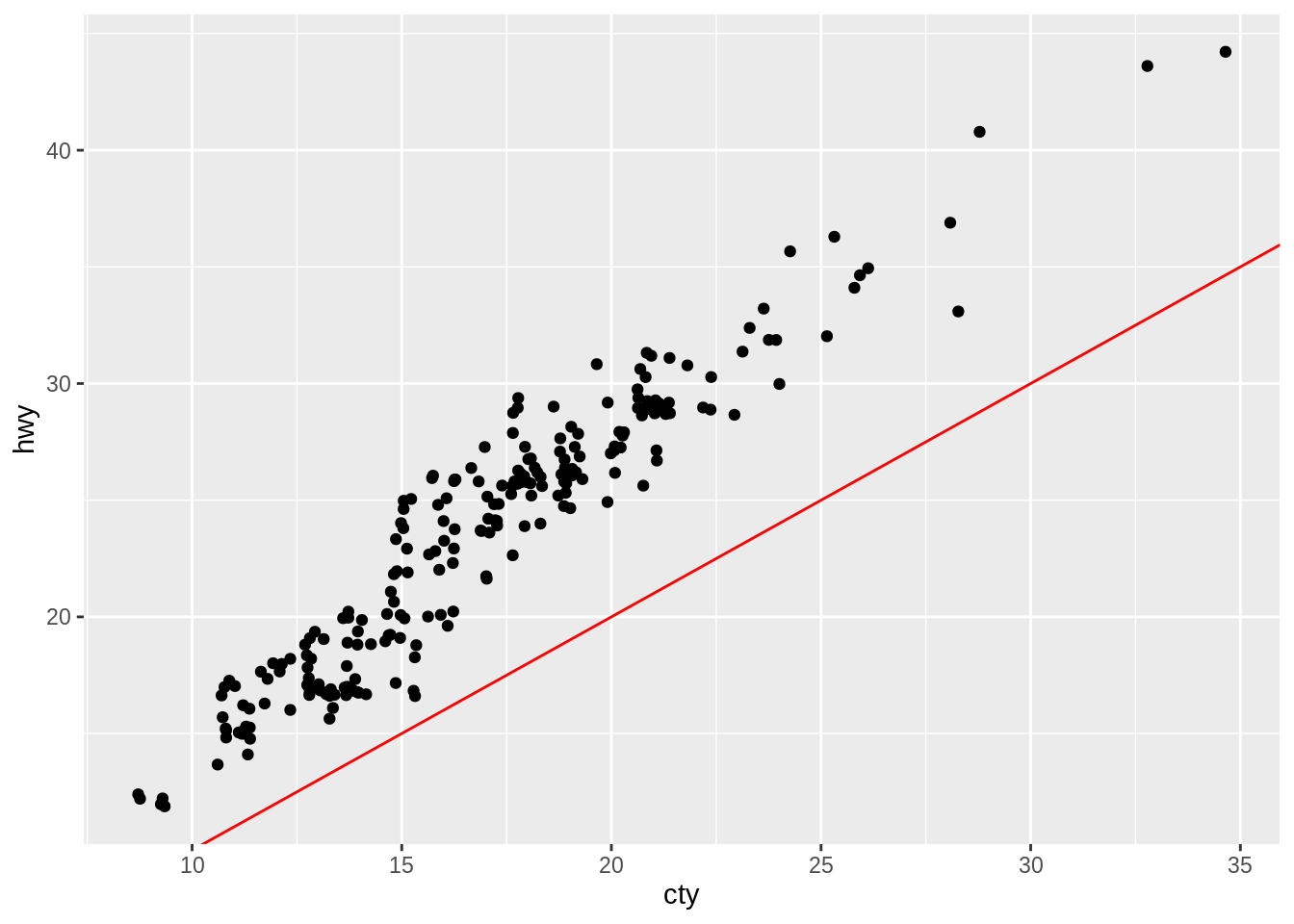
The coord_fixed() calls fixes the aspect ratio, and also the angle of the red line with slope 1:
ggplot(data = mpg) +
  geom_jitter(mapping = aes(x = cty, y = hwy)) +
  geom_abline(color = "red") +
  coord_fixed()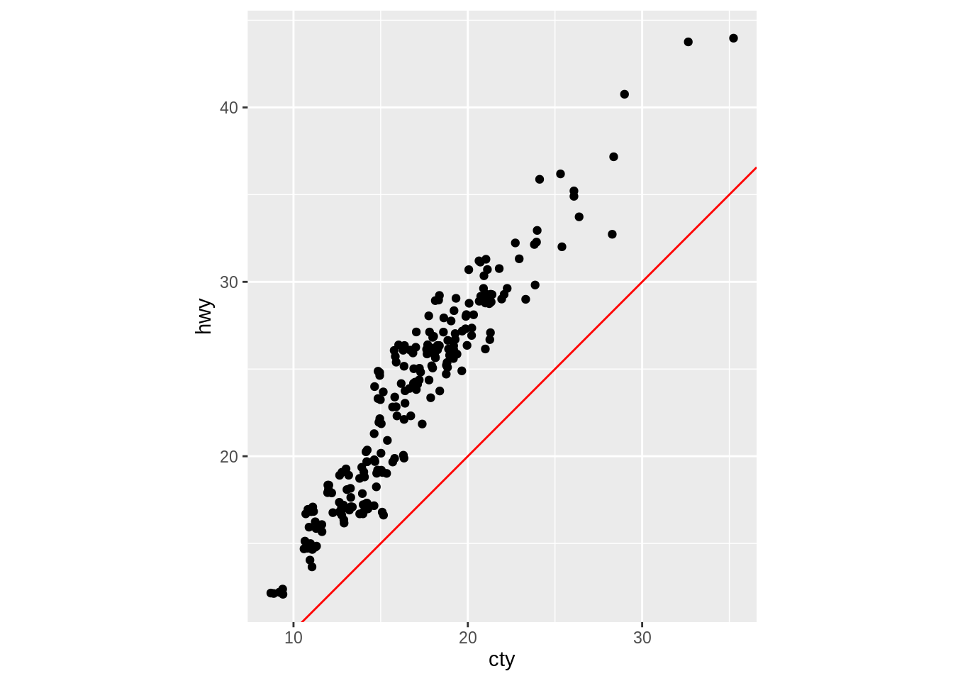
Tweaking the slope
Try to “estimate” an approximate ratio between the two economy measures by tweaking the slope argument to geom_abline().
► Solution:
Guessing 40 / 30 from the previous plot:
ggplot(data = mpg) +
  geom_jitter(mapping = aes(x = cty, y = hwy)) +
  geom_abline(slope = 40 / 30, color = "red") +
  coord_fixed()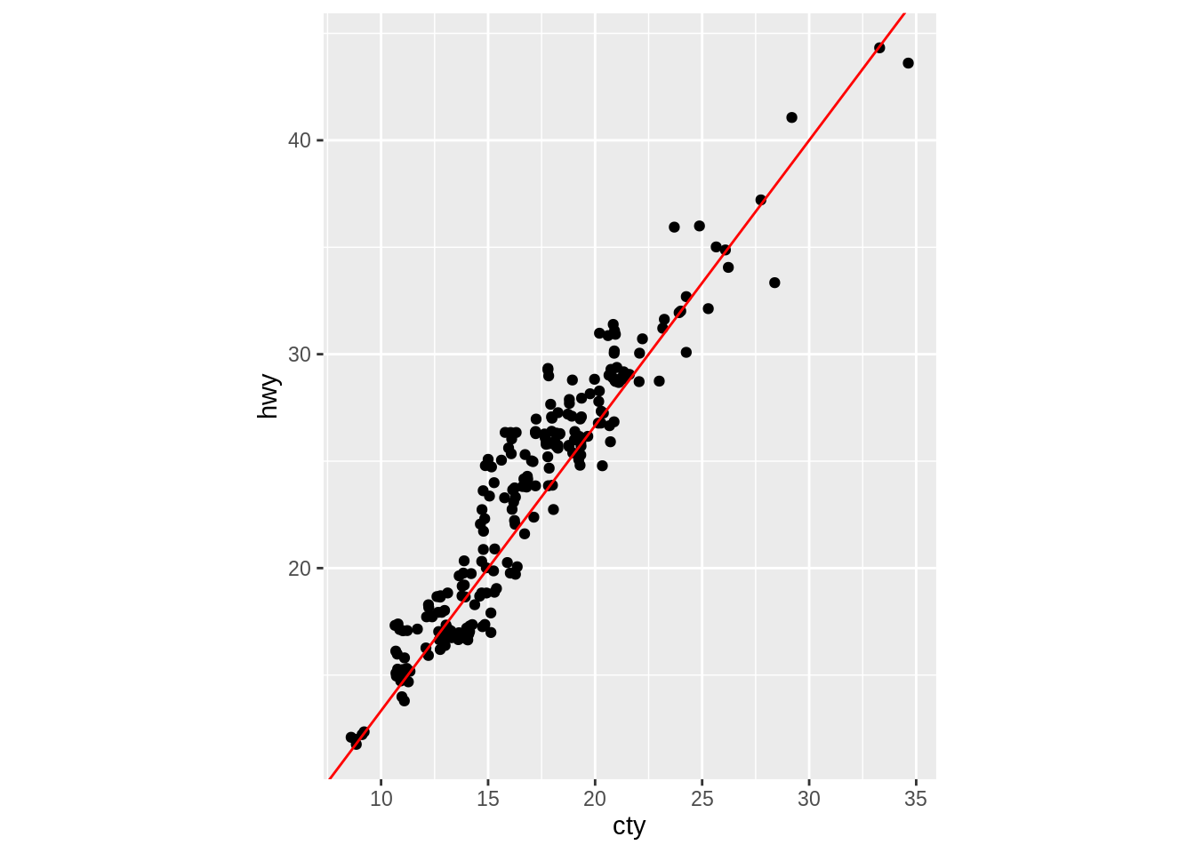
Copyright © 2019 Kirill Müller. Licensed under CC BY-NC 4.0.