Filtering and plotting
Kirill Müller, cynkra GmbH
Nov 28, 2017
Histogram of air time of all flights
Plot a histogram of the air time of all flights. Exclude Honolulu International Airport in Hawaii to get rid of the peak at the right-hand side. Zoom into the flights that have an air time between 400 and 500 minutes.
Hint: Start with flights %>% ggplot() + ...
flights %>%
  ggplot(___) +
    ___()

flights %>%
  filter(___) %>%
  ggplot(___) +
    ___()

flights %>%
  filter(___) %>%
  filter(___) %>%
  ___
► Solution:
flights %>%
  ggplot() +
  geom_histogram(
    aes(x = air_time),
    na.rm = TRUE,
    binwidth = 15
  )
flights %>%
  filter(dest != "HNL") %>%
  ggplot() +
  geom_histogram(
    aes(x = air_time),
    na.rm = TRUE,
    binwidth = 15
  )
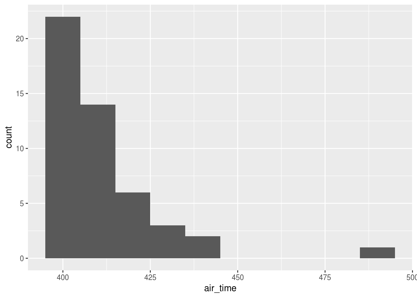
flights %>%
  filter(dest != "HNL") %>%
  filter(between(air_time, 400, 500)) %>%
  ggplot() +
  geom_histogram(
    aes(x = air_time),
    na.rm = TRUE,
    binwidth = 10
  )
All very close relations
Plot a heat map for all relations with an air time shorter than one hour.
Hint: Use geom_bin2d().
flights %>%
  filter(___) %>%
  ggplot(___) +
    ___()
► Solution:
flights %>%
  filter(air_time < 60) %>%
  ggplot() +
  geom_bin2d(aes(origin, dest))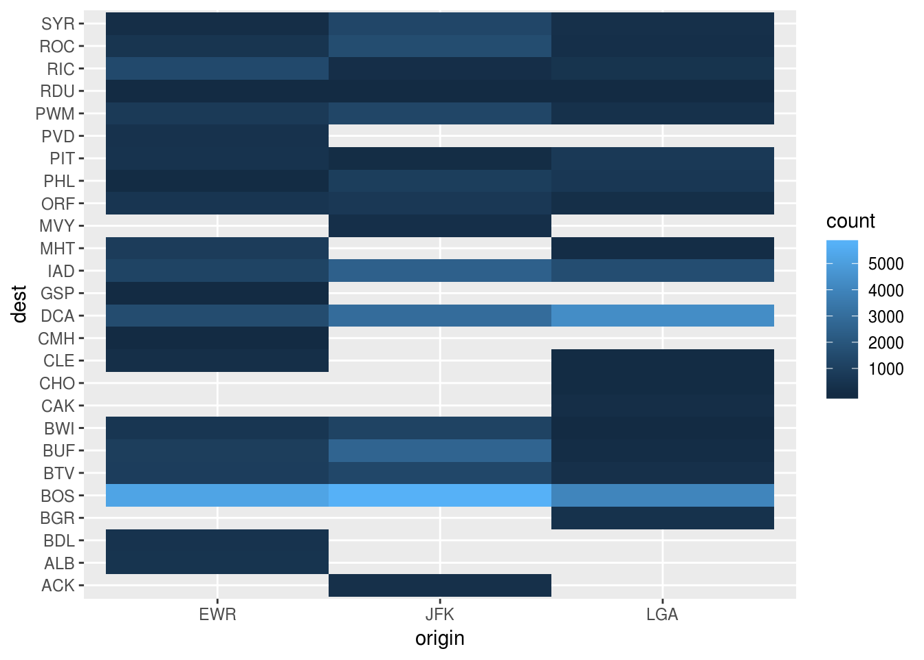
More plotting after filtering
Think of other plots of the flights data that would not work if applied on the full dataset but are useful when applying a filter beforehand.
Copyright © 2018 Kirill Müller. Licensed under CC BY-NC 4.0.