Statistical transformations
Kirill Müller
June 1, 2017
Cars by drivetrain
I tried geom_histogram() and geom_col(), neither worked. The histogram is for continuous data only, for geom_col() I’d need to supply actual counts which I don’t have. The geom_bar() function computes the counts for me by applying the "count" statistical transformation to my data before plotting.
We need only the “x” aesthetic, “y” is computed automatically. drv is the relevant variable.
ggplot(mpg) +
  geom_bar(aes(x = drv))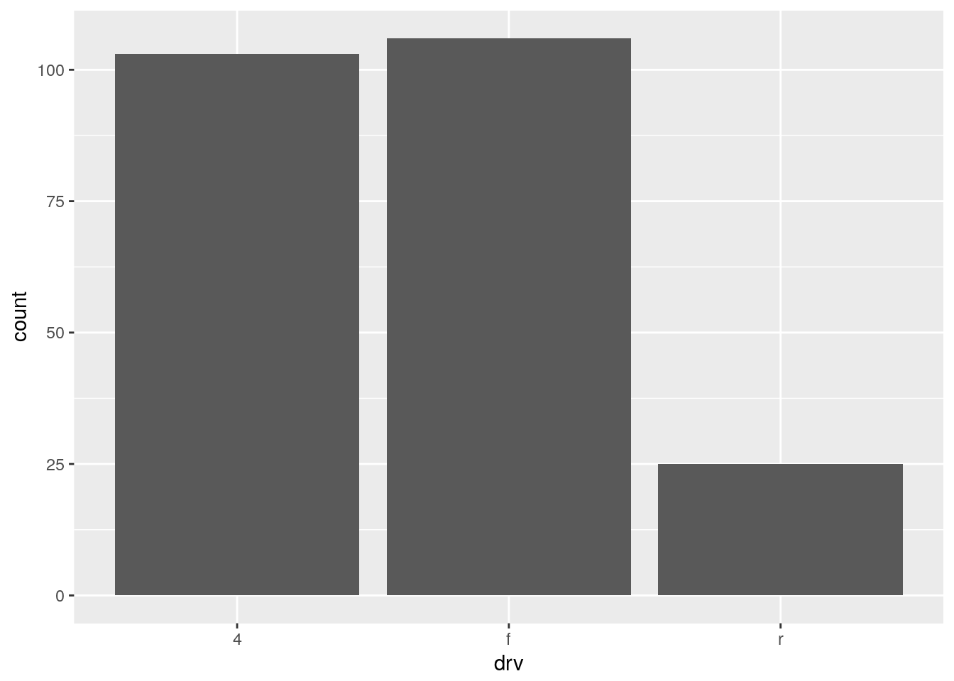
Explicit count
The output is the same:
ggplot(data = mpg) +
  geom_bar(mapping = aes(x = drv, y = ..count..))
By default, geom_bar() plots the computed “count” aesthetic, which is by convention written with two surrounding dots.
Proportions
Plotting overall proportions changes the y scale:
ggplot(data = mpg) +
  geom_bar(mapping = aes(x = drv, y = ..prop.., group = 1))
Omitting group will plot proportions per drivetrain in each column, which are 1 by default:
ggplot(data = mpg) +
  geom_bar(mapping = aes(x = drv, y = ..prop..))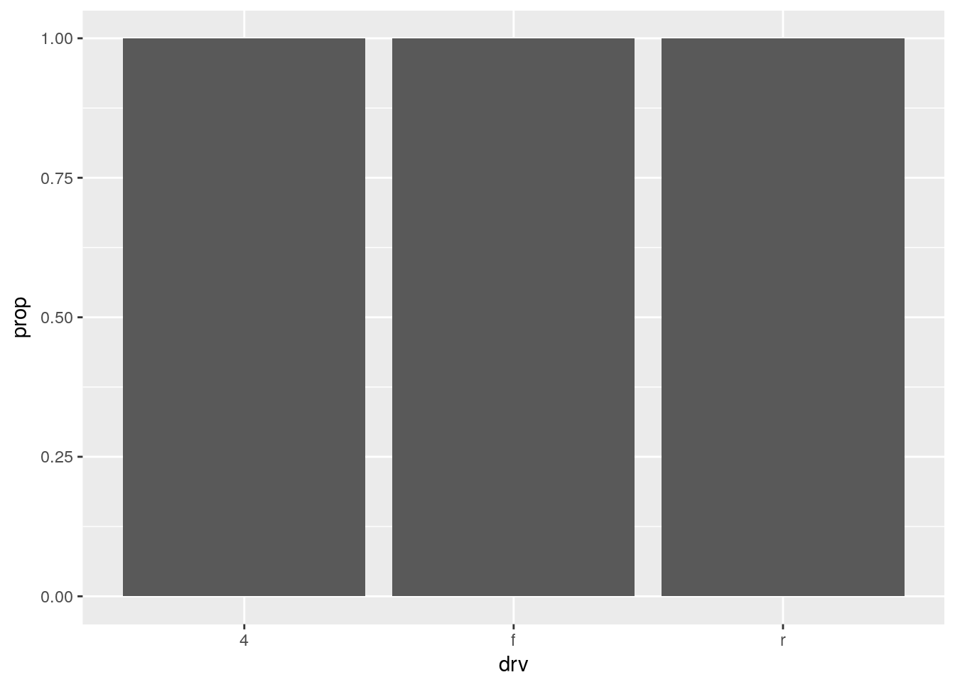
Fuel economy
We use a histogram of hwy, again only the “x” aesthetic needs to be supplied:
ggplot(data = mpg) +
  geom_histogram(mapping = aes(x = hwy))
## `stat_bin()` using `bins = 30`. Pick better value with `binwidth`.
The bin width should be set explicitly to avoid the warning:
ggplot(data = mpg) +
  geom_histogram(
    mapping = aes(x = hwy),
    binwidth = 1
  )
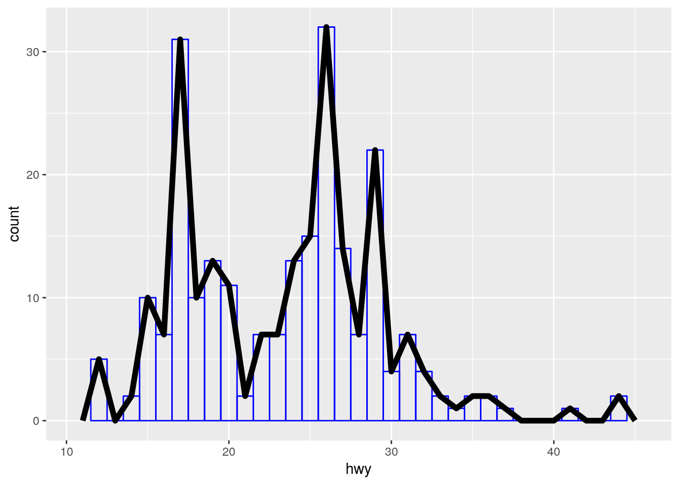
The frequency polygon is very similar. We tweak aesthetics manually in order to be able to distinguish between both layers.
ggplot(data = mpg) +
  geom_histogram(
    mapping = aes(x = hwy),
    fill = NA,
    color = "blue",
    binwidth = 1
  ) +
  geom_freqpoly(
    mapping = aes(x = hwy),
    binwidth = 1,
    size = 2
  )
Fuel economy by drivetrain
We can set the “fill” aesthetic:
ggplot(data = mpg) +
  geom_histogram(
    mapping = aes(x = hwy, fill = drv),
    binwidth = 1
  )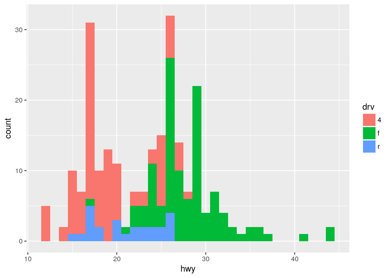
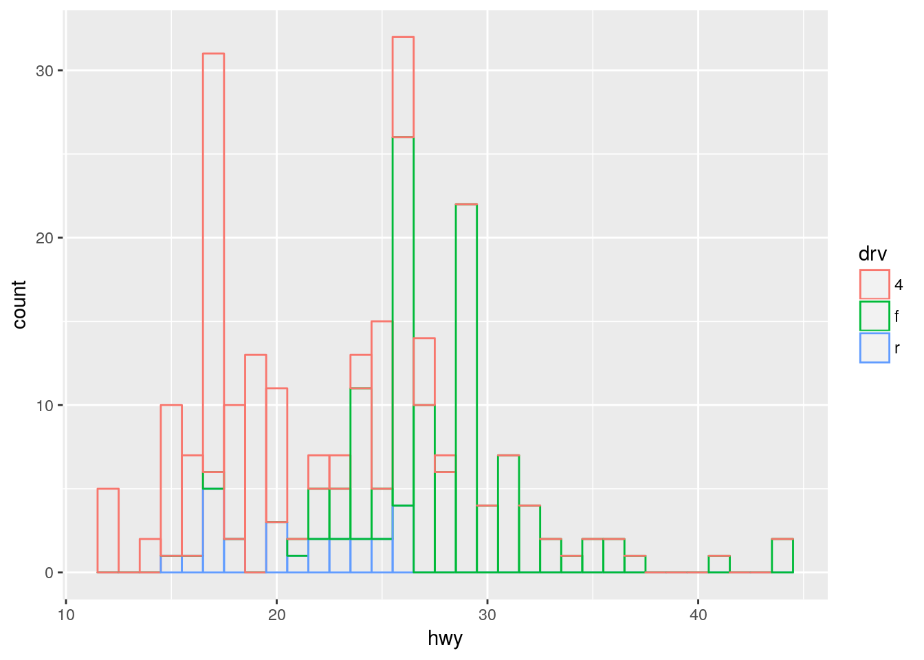
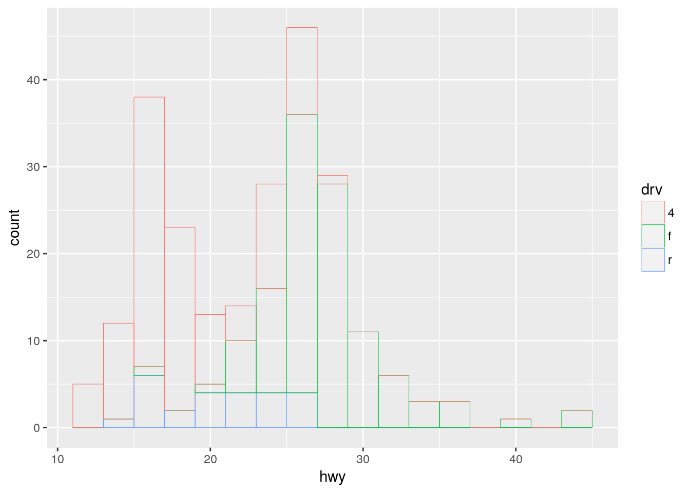
However, some bars are hidden. This happens less if we use color instead:
ggplot(data = mpg) +
  geom_histogram(
    mapping = aes(x = hwy, color = drv),
    fill = NA,
    binwidth = 1
  )
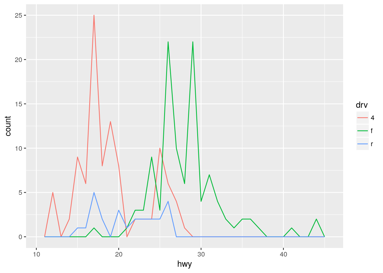
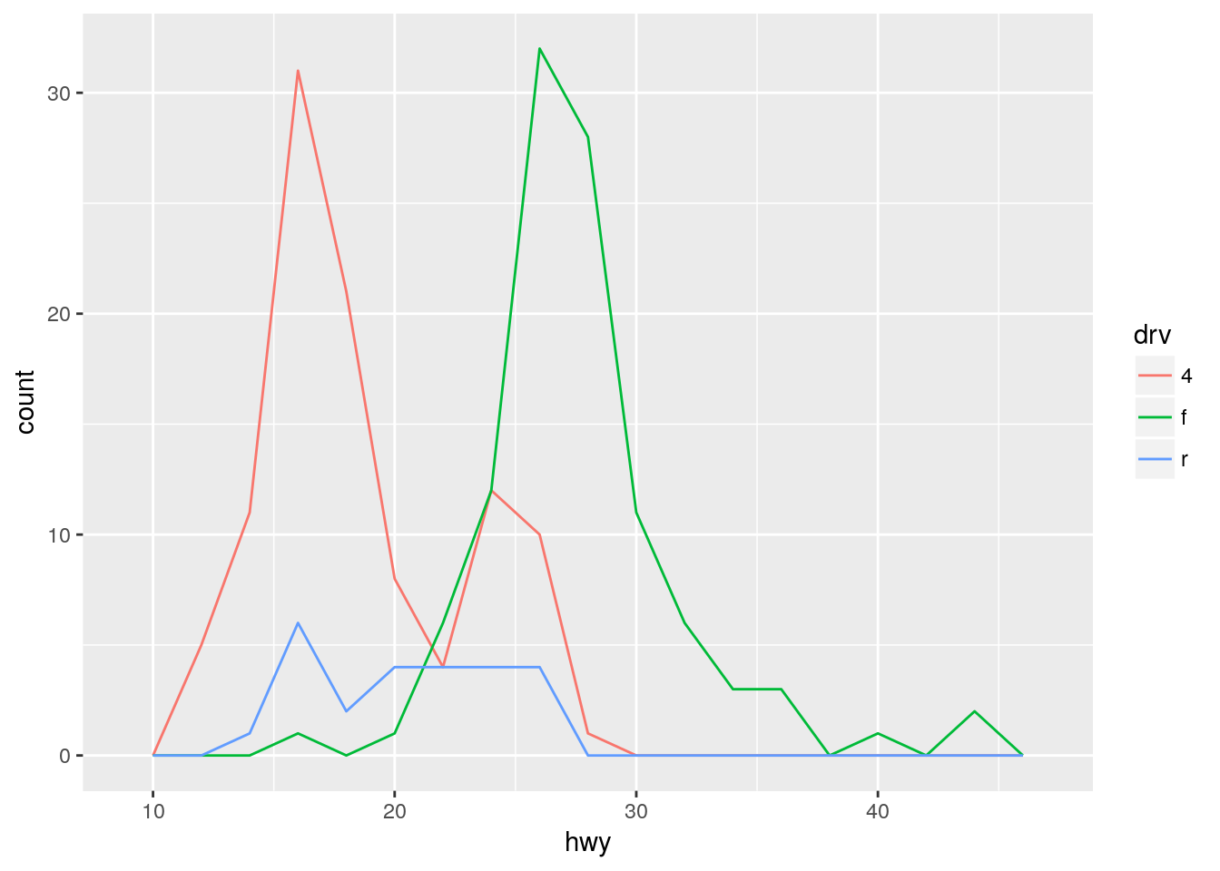
The frequency polygon offers a much clearer display of the same data:
ggplot(data = mpg) +
  geom_freqpoly(
    mapping = aes(x = hwy, color = drv),
    binwidth = 1
  )
Fuel economy per drivetrain (a history of failed attempts)
Can I just copy and adapt the code from the last solution?
ggplot(mpg, aes(hwy, color = drv)) +
  geom_histogram(fill = NA, color = "black", size = 0.2, binwidth = 2) +
  geom_freqpoly(color = "red", binwidth = 2)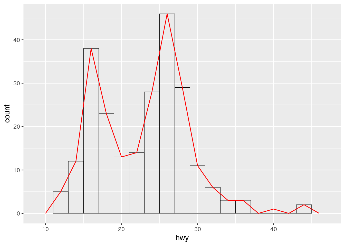
Nope. Something’s wrong here. Maybe if I follow the template?
ggplot(mpg) +
  geom_histogram(
    aes(hwy, color = drv),
    binwidth = 2,
    fill = NA,
    color = "black",
    size = 0.2
  )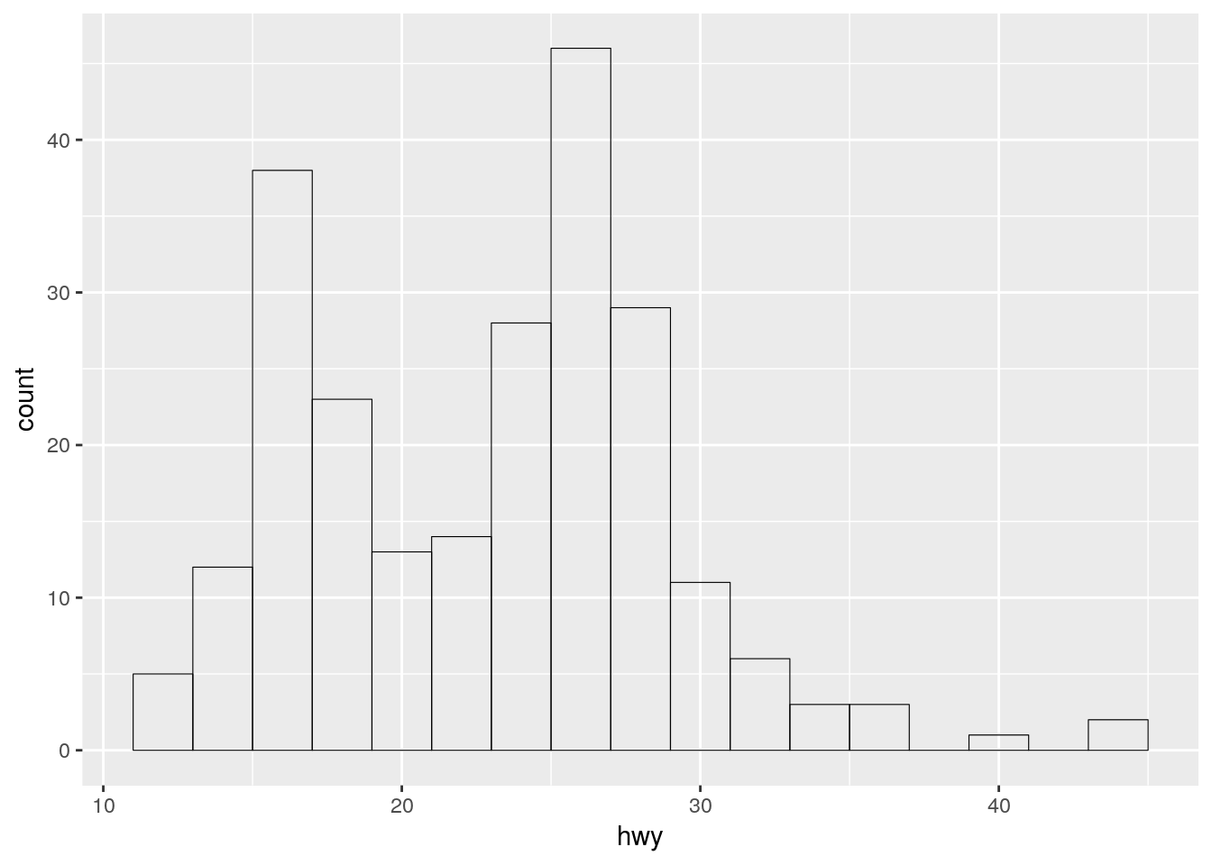
I can’t use color both as variable and manual aesthetic, ggplot2 silently uses the manual assignment! Need to be careful with assigning aesthetics.
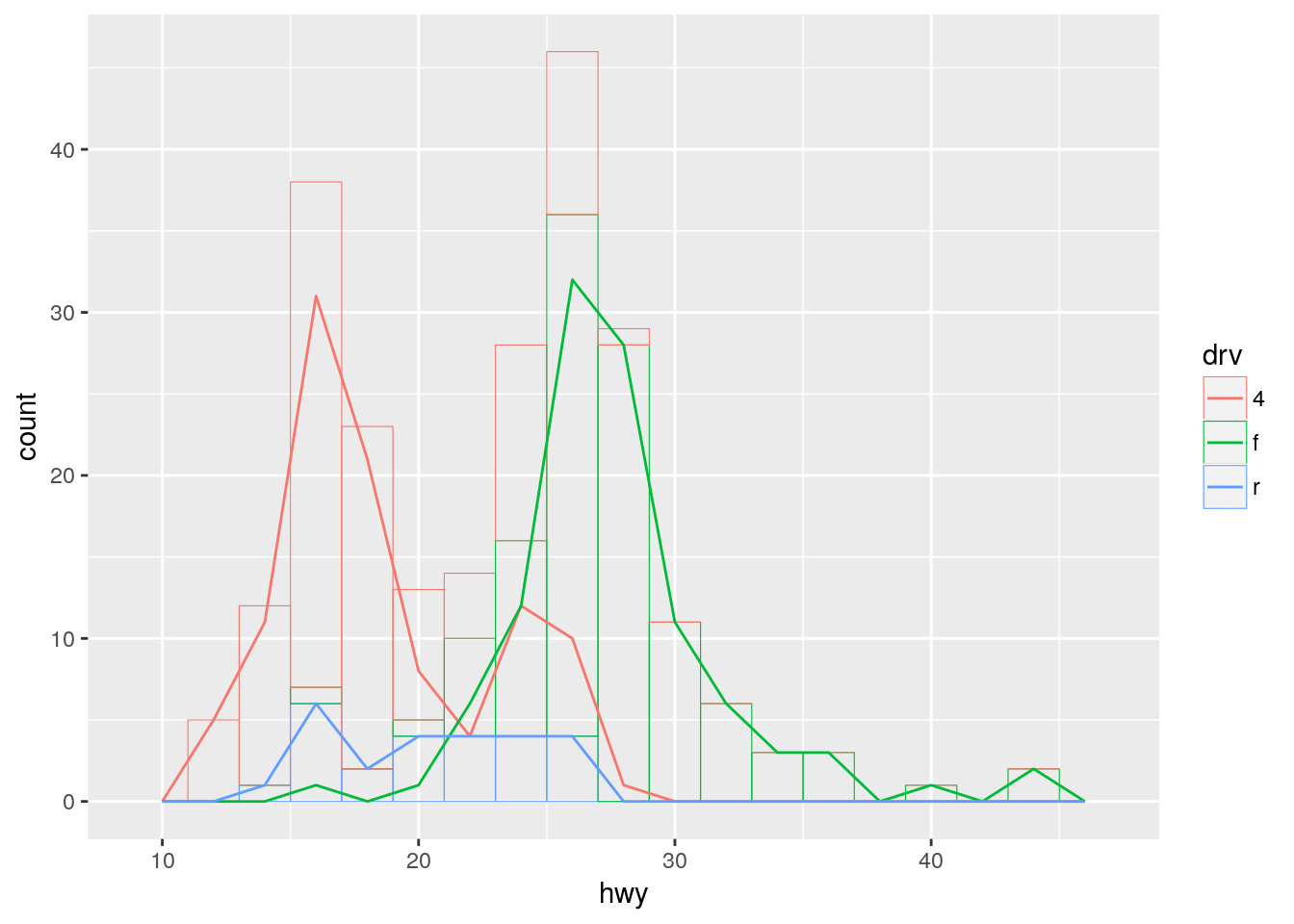
ggplot(mpg) +
  geom_histogram(
    aes(hwy, color = drv, group = drv),
    binwidth = 2,
    size = 0.2,
    fill = NA
  ) +
  geom_freqpoly(
    aes(hwy, color = drv, group = drv),
    binwidth = 2
  )
ggplot(mpg) +
  geom_histogram(
    aes(hwy, color = drv),
    binwidth = 2,
    size = 0.2,
    fill = NA
  )
ggplot(mpg) +
  geom_freqpoly(
    aes(hwy, color = drv),
    binwidth = 2
  )
Copyright © 2018 Kirill Müller. Licensed under CC BY-NC 4.0.