Other geoms
Kirill Müller
June 1, 2017
Arguments to geom_smooth()
method uses a different model to fit the data:
ggplot(data = mpg) +
  geom_point(mapping = aes(x = displ, y = hwy)) +
  geom_smooth(mapping = aes(x = displ, y = hwy), method = "lm")
se = FALSE turns off the confidence band:
ggplot(data = mpg) +
  geom_point(mapping = aes(x = displ, y = hwy)) +
  geom_smooth(mapping = aes(x = displ, y = hwy), se = FALSE)
## `geom_smooth()` using method = 'loess'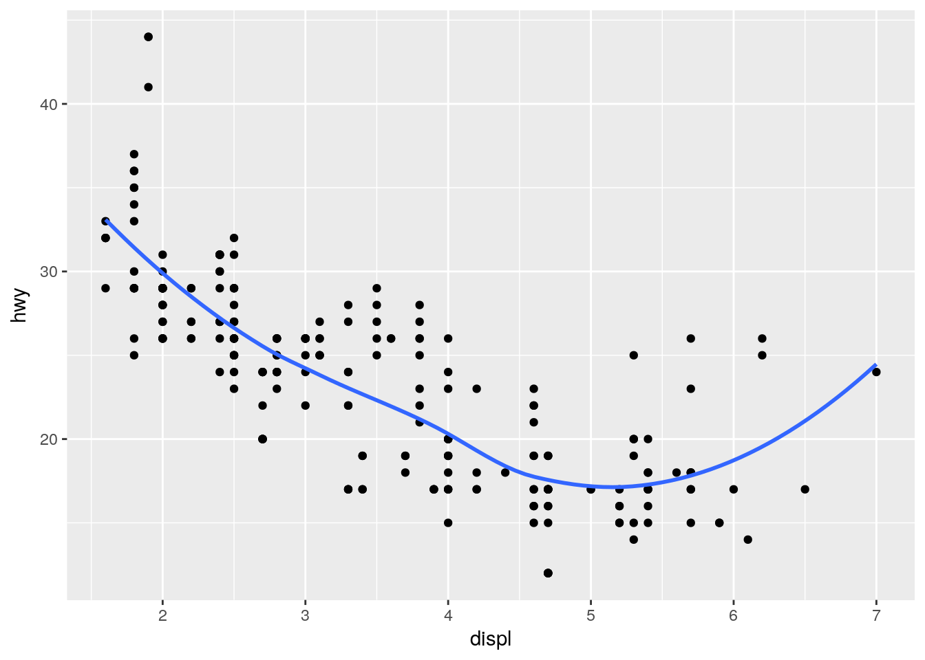
The rug
Plots marginal distributions of the data close to the axes.
ggplot(data = mpg) +
  geom_point(mapping = aes(x = displ, y = hwy)) +
  geom_rug(mapping = aes(x = displ, y = hwy))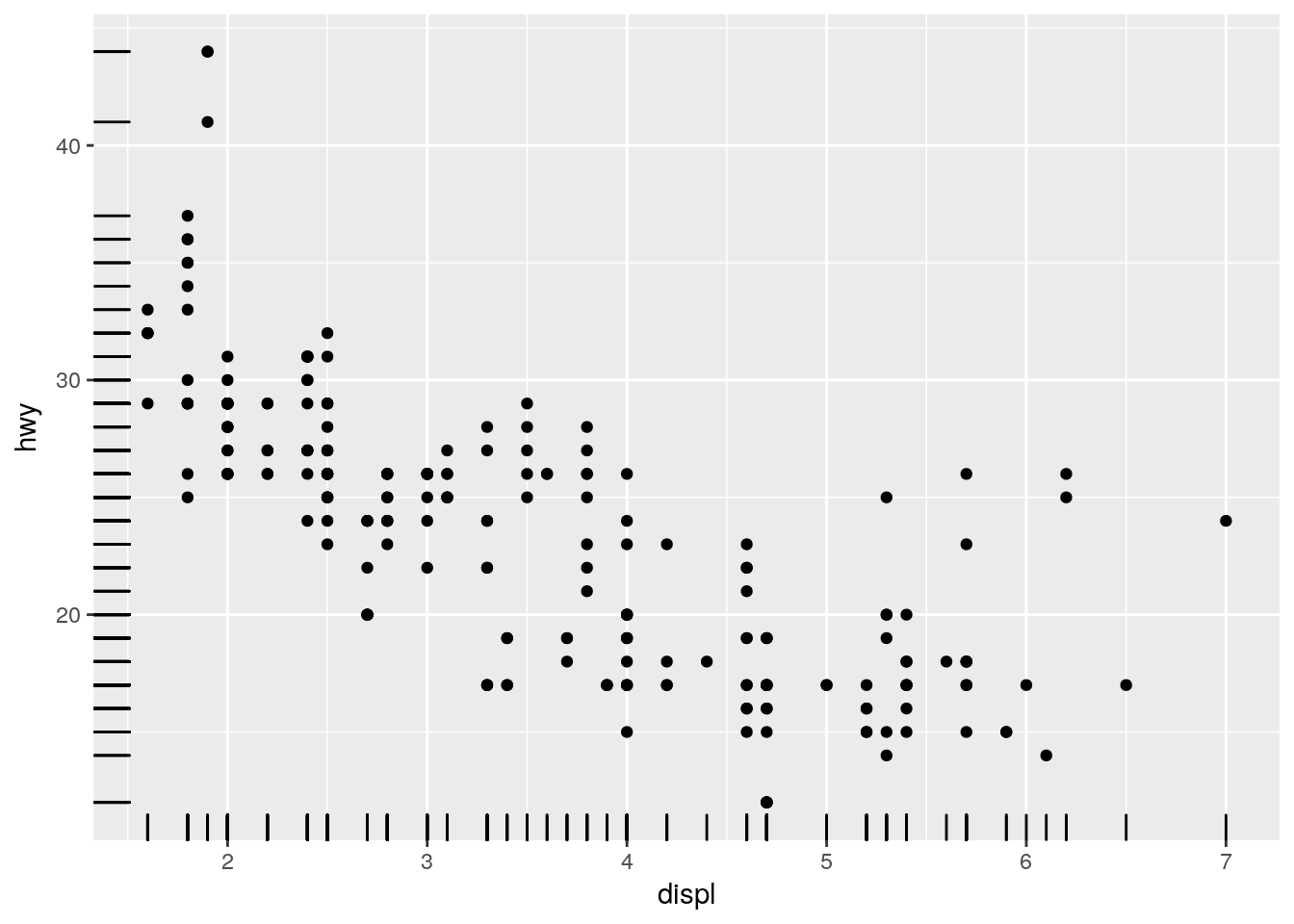
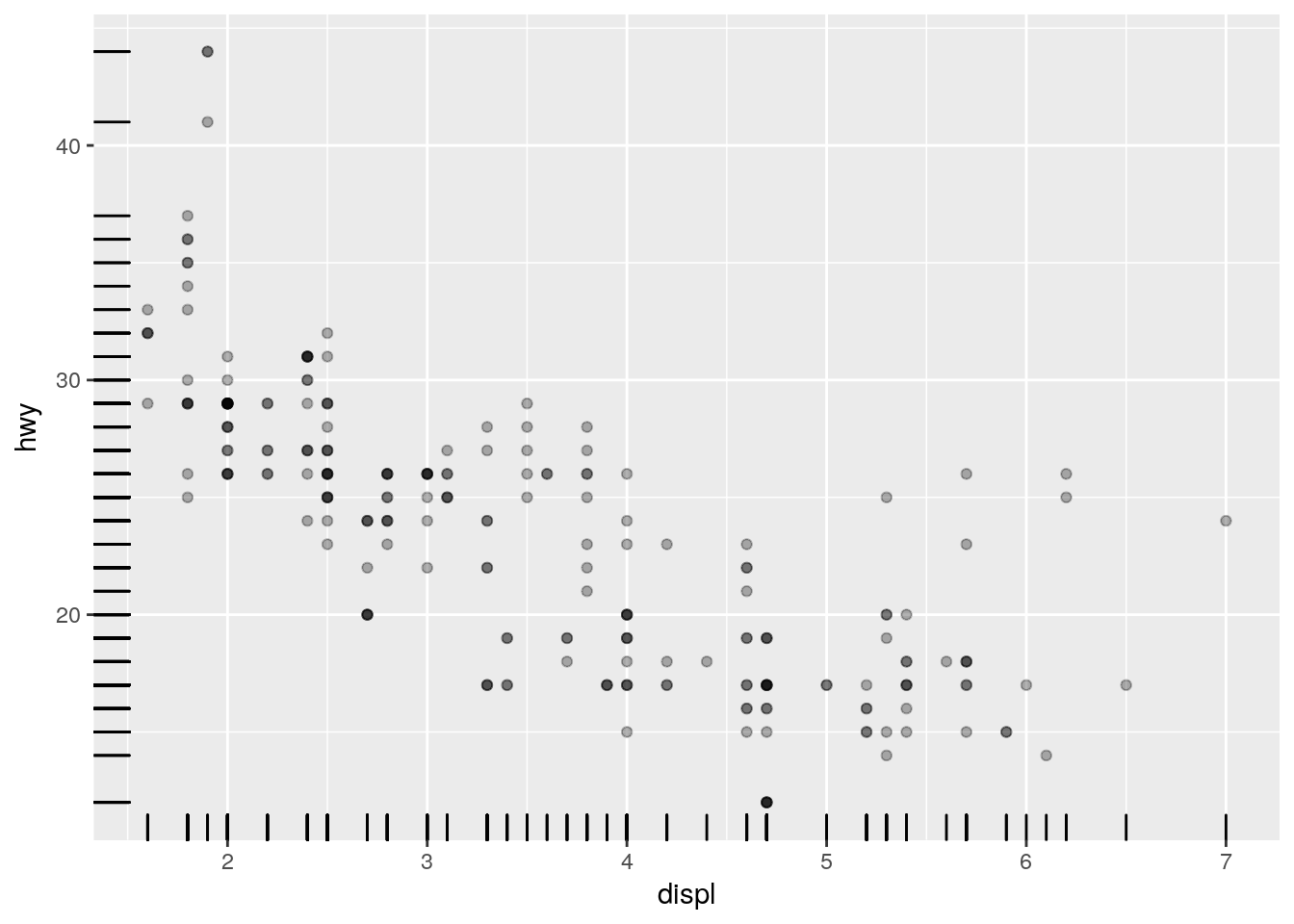
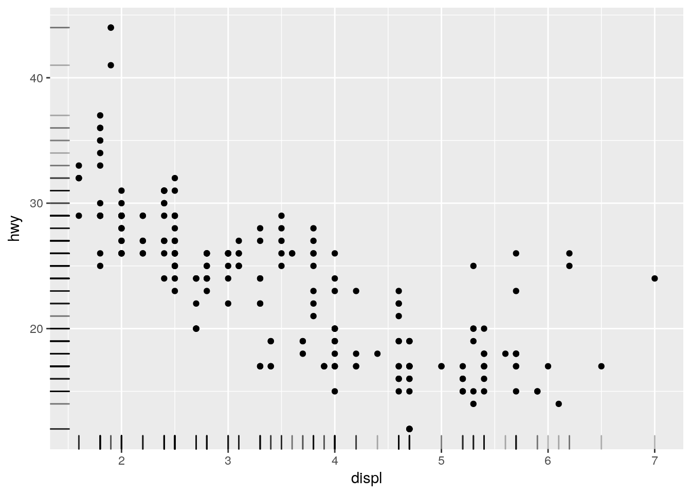
To reduce overplotting, the “alpha” aesthetic can be set independently for each geom to a constant value:
ggplot(data = mpg) +
  geom_point(
    mapping = aes(x = displ, y = hwy),
    alpha = 0.3
  ) +
  geom_rug(
    mapping = aes(x = displ, y = hwy)
  )
ggplot(data = mpg) +
  geom_point(
    mapping = aes(x = displ, y = hwy)
  ) +
  geom_rug(
    mapping = aes(x = displ, y = hwy),
    alpha = 0.3
  )
Order of geom_...() calls
The geoms are painted in order of appearance:
ggplot(data = mpg) +
  geom_point(mapping = aes(x = displ, y = hwy)) +
  geom_smooth(mapping = aes(x = displ, y = hwy))
## `geom_smooth()` using method = 'loess'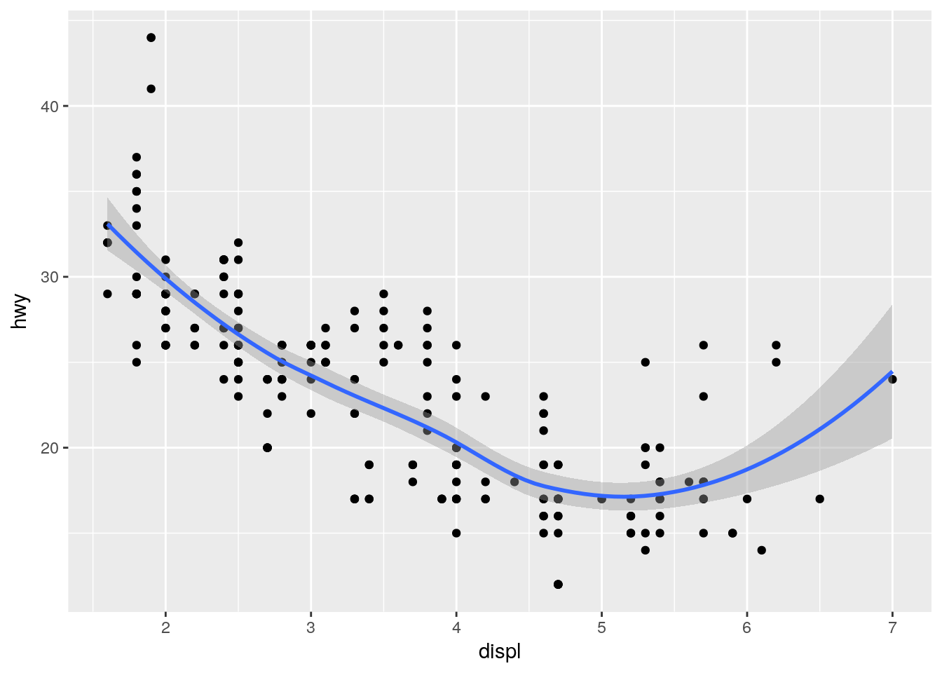
ggplot(data = mpg) +
  geom_smooth(mapping = aes(x = displ, y = hwy)) +
  geom_point(mapping = aes(x = displ, y = hwy))
## `geom_smooth()` using method = 'loess'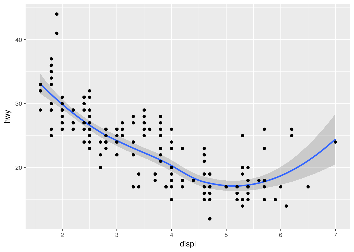
Compare highway and city
We could add two layers, each with a different color. But this still doesn’t give us a legend.
ggplot(data = mpg) +
  geom_point(mapping = aes(x = displ, y = hwy), color = "red") +
  geom_point(mapping = aes(x = displ, y = cty), color = "blue")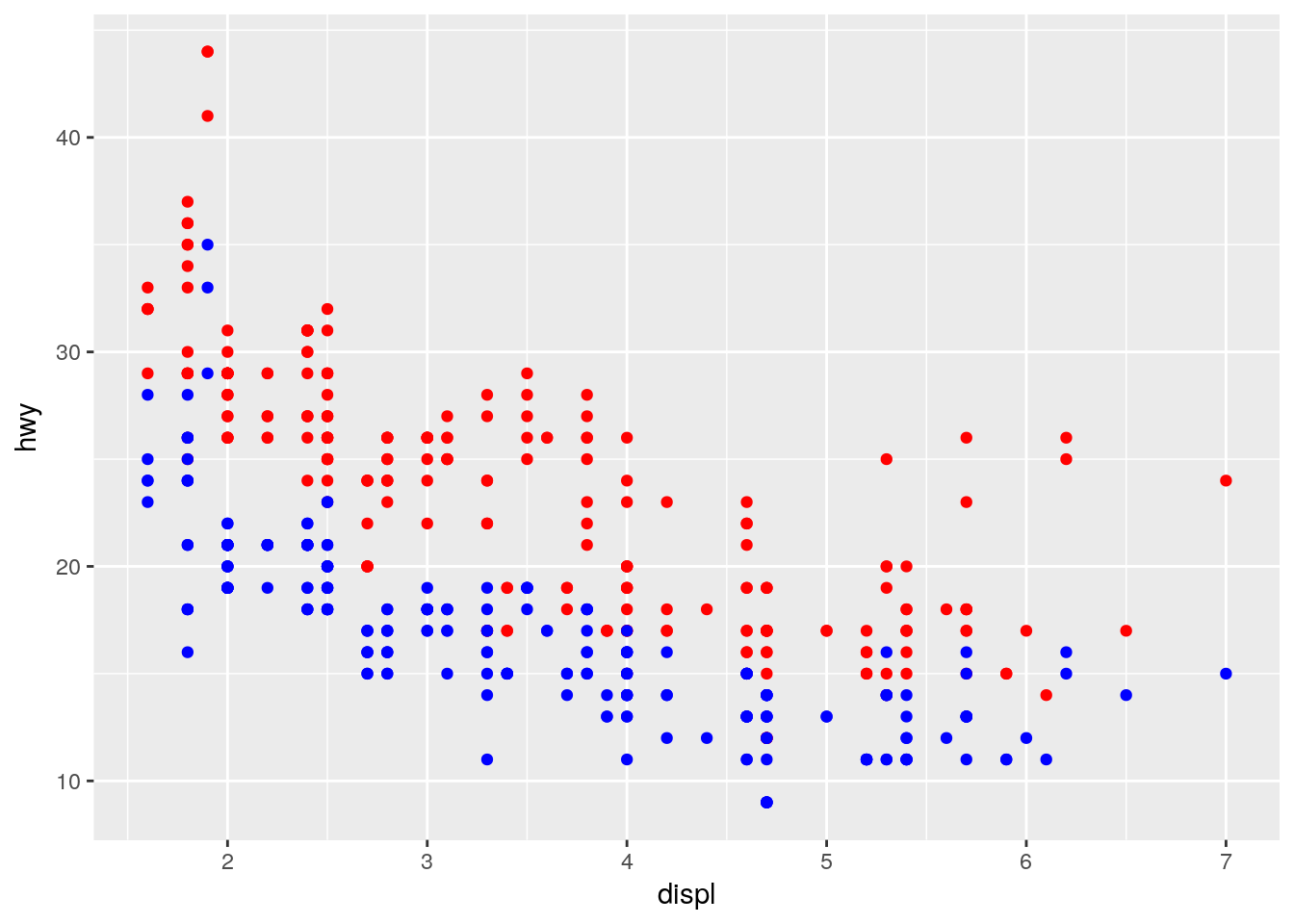
We need better data transformation tools to reformat the data for plotting it in a more natural way.
Copyright © 2018 Kirill Müller. Licensed under CC BY-NC 4.0.