Scales
Kirill Müller
June 1, 2017
Naming scales
Reusing a plot from the previous exercise:
ggplot(data = mpg) +
  geom_point(
    mapping = aes(x = displ, y = hwy, color = factor(year))
  ) +
  geom_smooth(
    mapping = aes(x = displ, y = hwy, color = factor(year)),
    method = "lm"
  ) +
  facet_wrap(~class) +
  scale_x_continuous(name = "Displacement") +
  scale_y_continuous(name = "Fuel economy [miles per gallon]") +
  scale_color_discrete(name = "Year")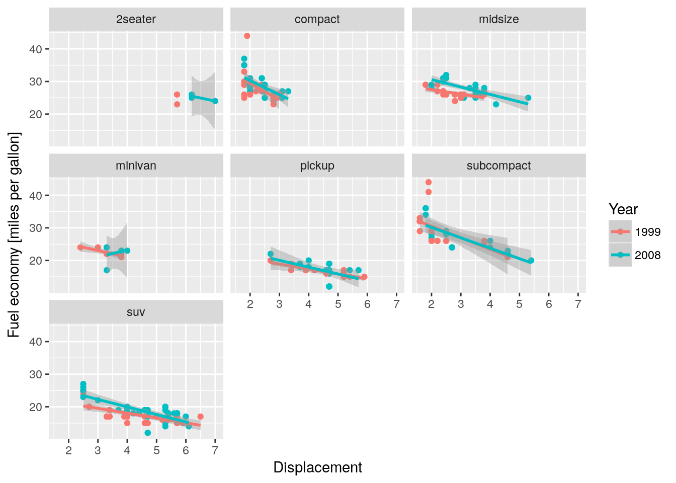
There exist shortcuts xlab() and ylab() for x and y labels, but not for color or fill. I recommend to stick with the explicit versions.
Changing scales twice
A warning occurs:
ggplot(data = mpg) +
  geom_point(mapping = aes(x = displ, y = hwy)) +
  scale_x_continuous(name = "Displacement") +
  scale_x_continuous(name = "Displacement")
## Scale for 'x' is already present. Adding another scale for 'x', which
## will replace the existing scale.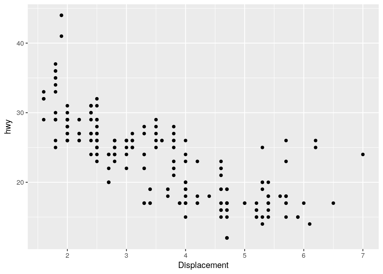
ColorBrewer scales
RColorBrewer::display.brewer.all(colorblindFriendly = TRUE)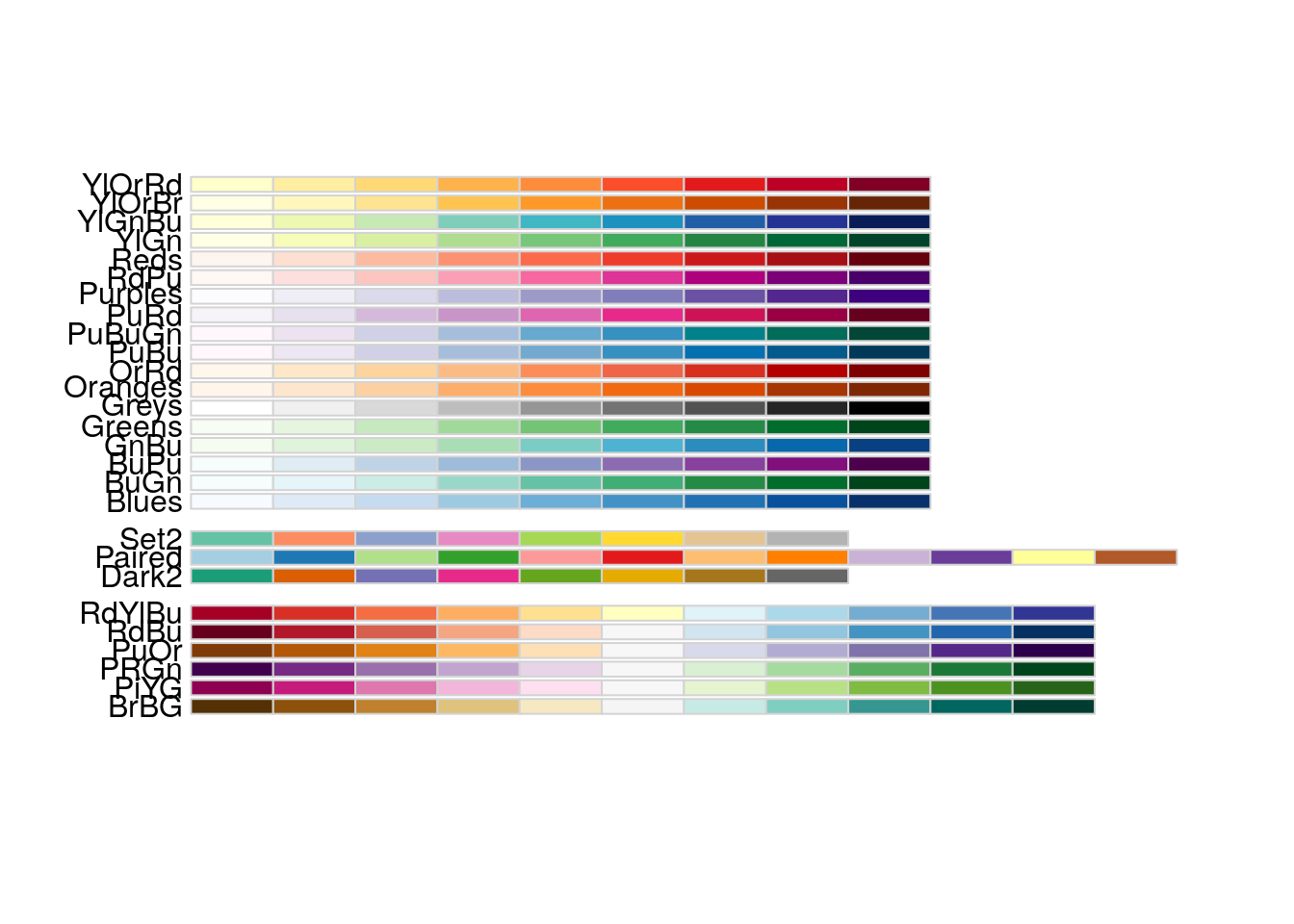
A better scale for car class
ggplot(data = mpg) +
  geom_jitter(mapping = aes(x = displ, y = hwy, color = class)) +
  scale_x_continuous(name = "Displacement") +
  scale_y_continuous(name = "Fuel economy [miles per gallon]") +
  scale_color_brewer(name = "Car class", palette = "Set2")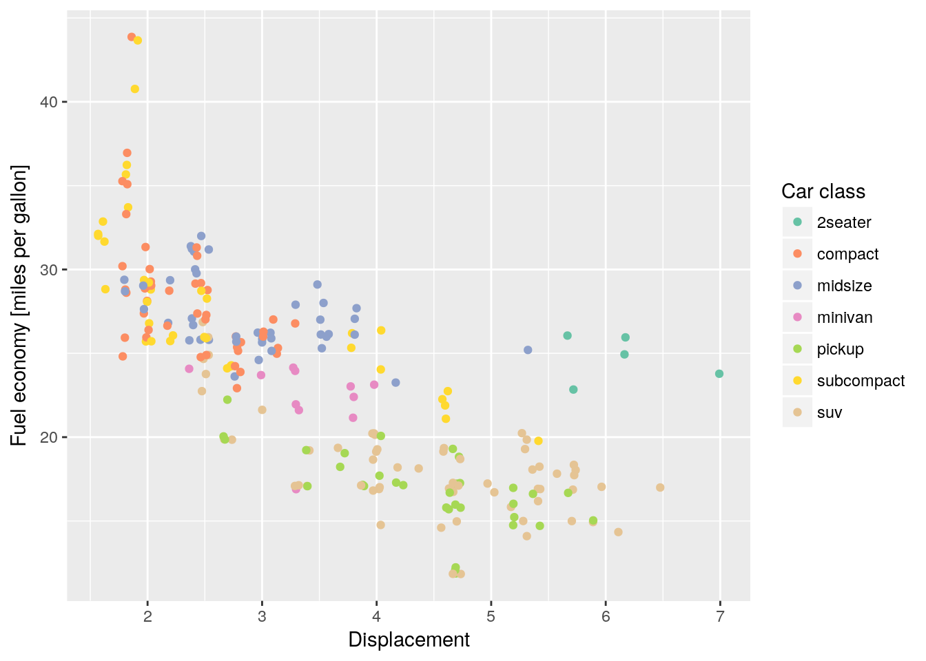
Copyright © 2017 Kirill Müller. Licensed under CC BY-NC 4.0.