Mutate
Kirill Müller
June 2, 2017
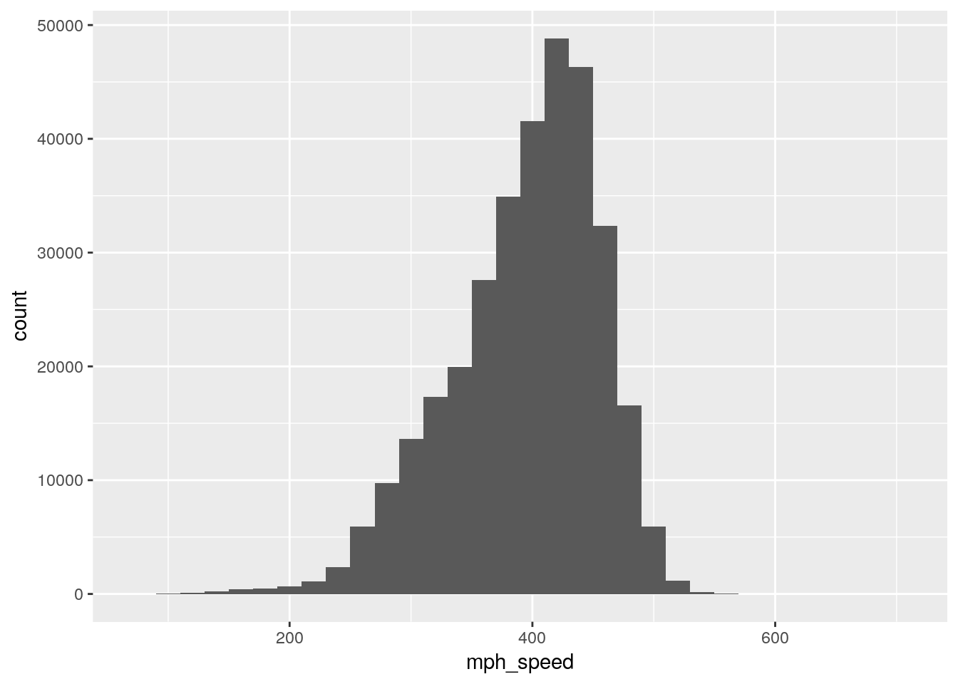
Speed as miles per hour
flights %>%
  mutate(mph_speed = distance / air_time * 60) %>%
  ggplot() +
  geom_histogram(
    aes(mph_speed),
    na.rm = TRUE,
    binwidth = 20
  )
flights %>%
  ggplot() +
  geom_histogram(aes(distance / air_time))
## `stat_bin()` using `bins = 30`. Pick better value with `binwidth`.## Warning: Removed 9430 rows containing non-finite values (stat_bin).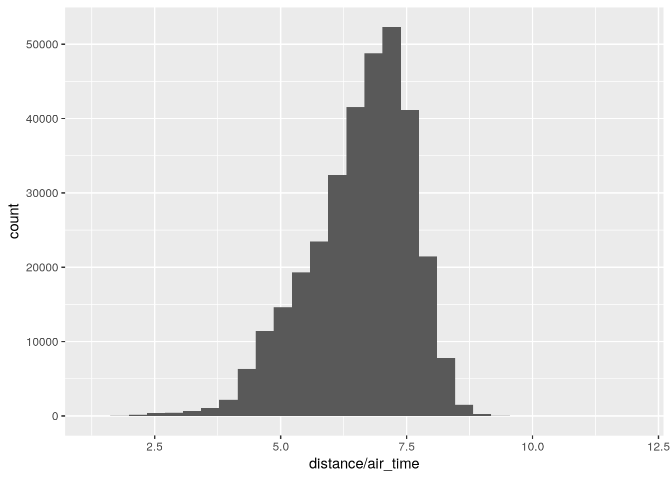
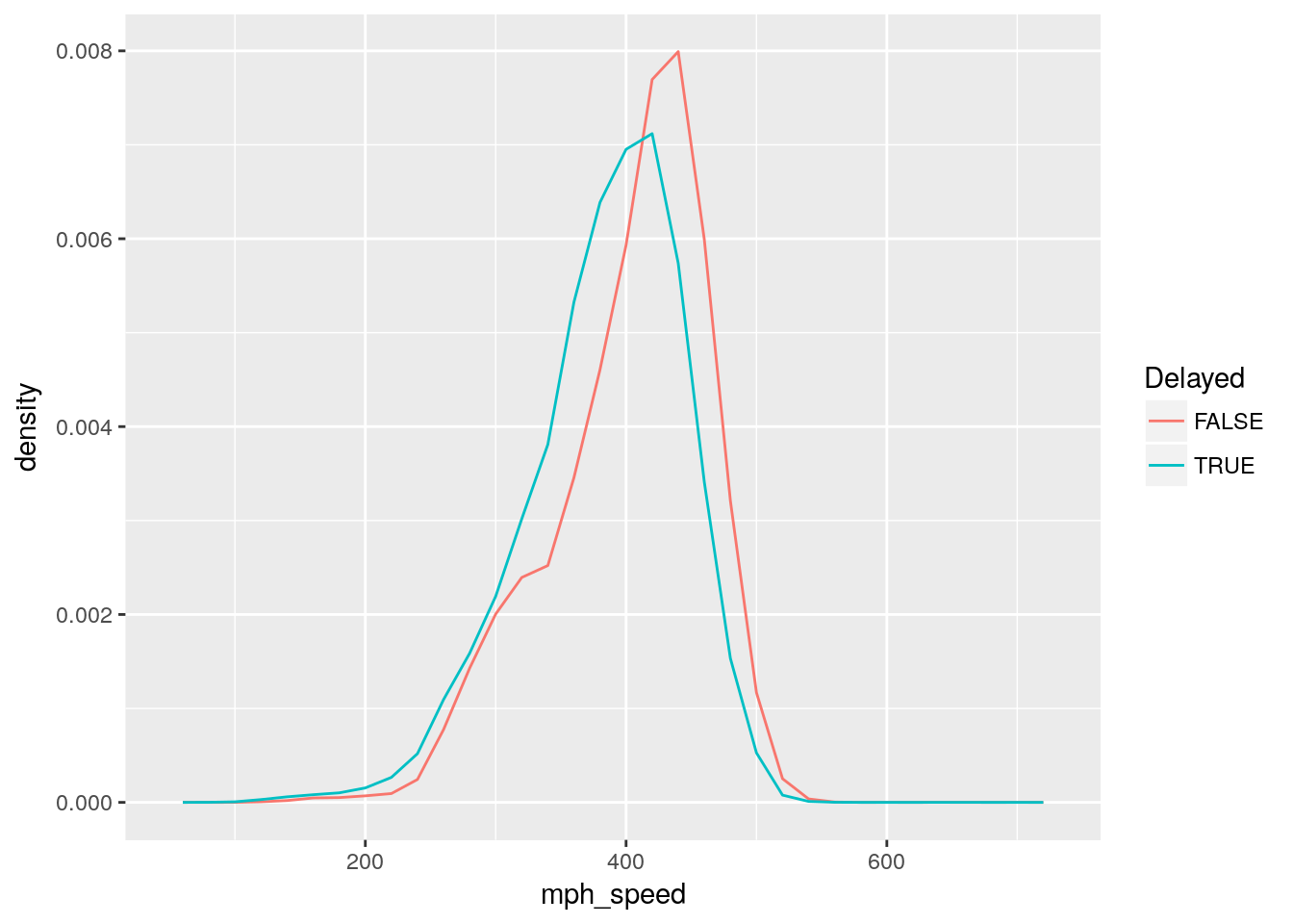
Speed distributions
flights %>%
  mutate(mph_speed = distance / air_time * 60) %>%
  mutate(Delayed = arr_delay > 0) %>%
  ggplot() +
  geom_freqpoly(
    aes(x = mph_speed, y = ..density.., color = Delayed),
    na.rm = TRUE,
    binwidth = 20
  )
flights %>%
  mutate(mph_speed = distance / air_time * 60) %>%
  mutate(Delayed = arr_delay > 0) %>%
  filter(!is.na(Delayed)) %>%
  ggplot() +
  geom_histogram(
    aes(x = mph_speed),
    binwidth = 20
  ) +
  facet_wrap(~Delayed, ncol = 1)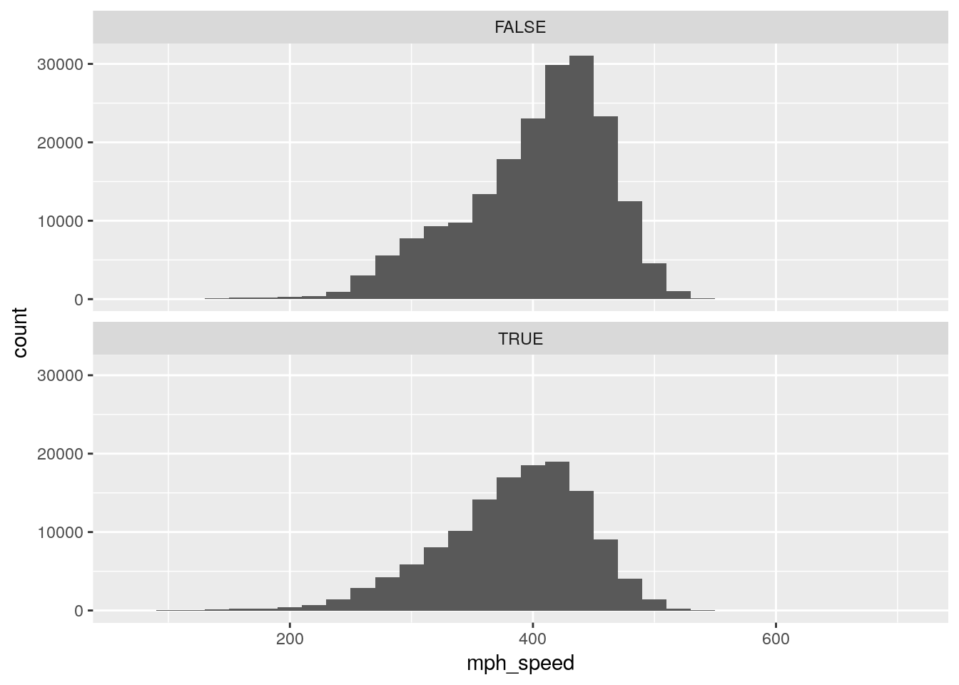
Deviation from average departure delay
flights %>%
  mutate(dev = dep_delay - mean(dep_delay, na.rm = TRUE)) %>%
  ggplot() +
  geom_violin(aes(x = origin, y = dev), na.rm = TRUE)
Copyright © 2017 Kirill Müller. Licensed under CC BY-NC 4.0.